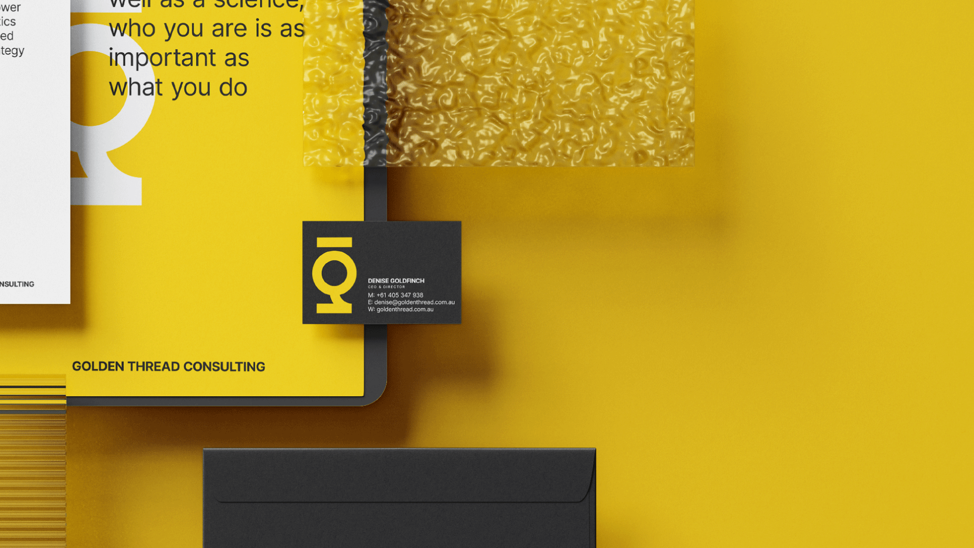
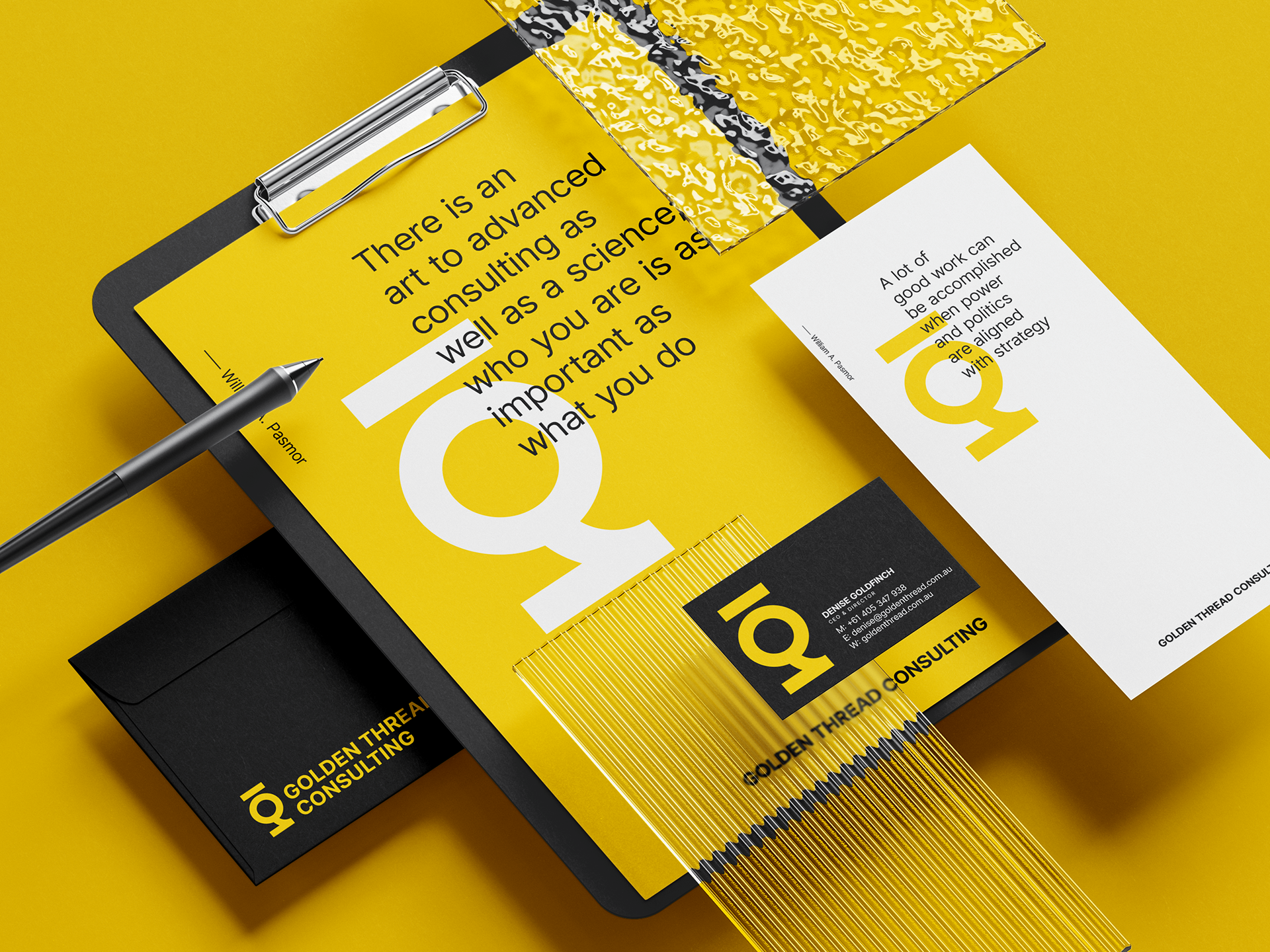
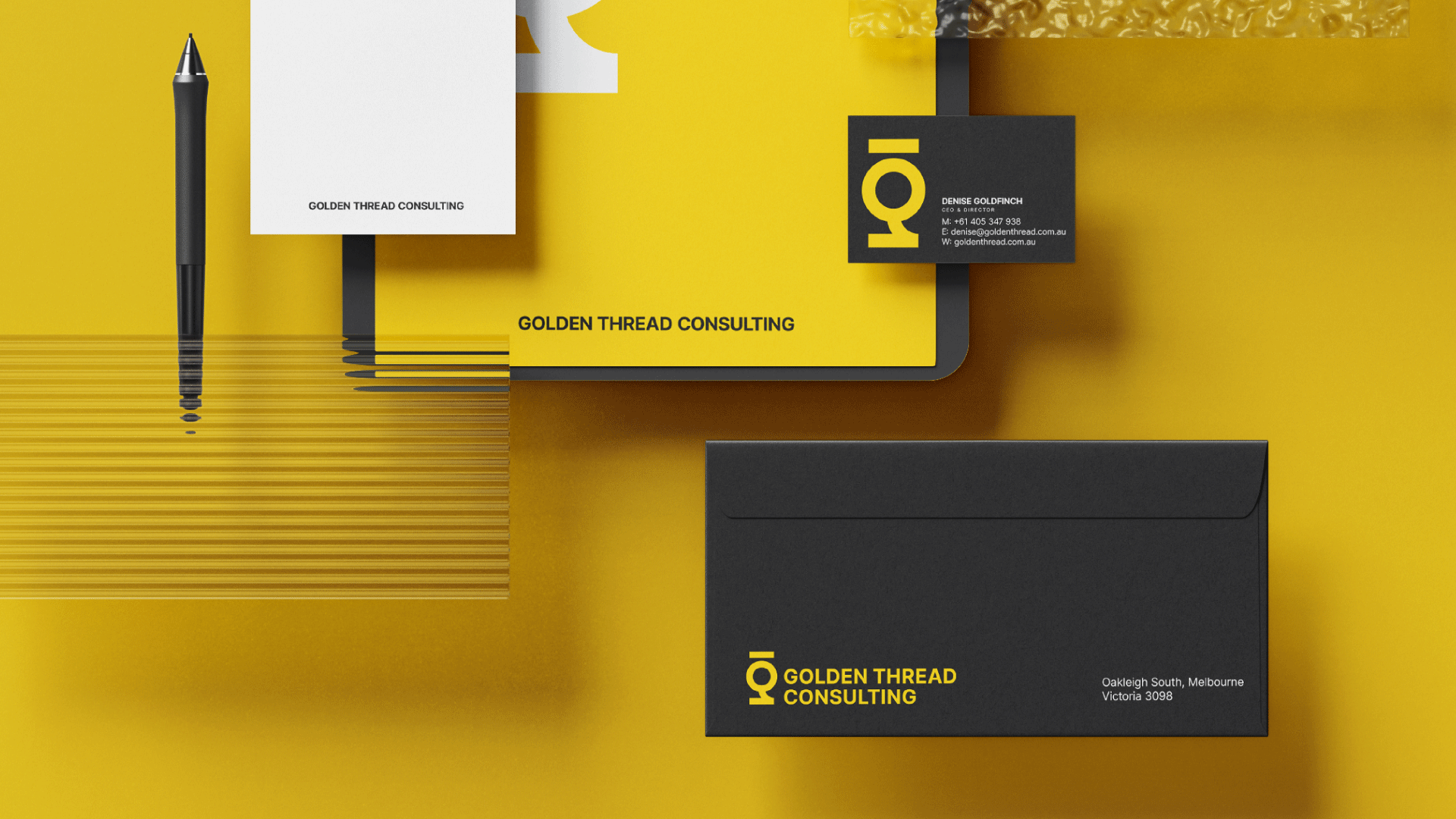
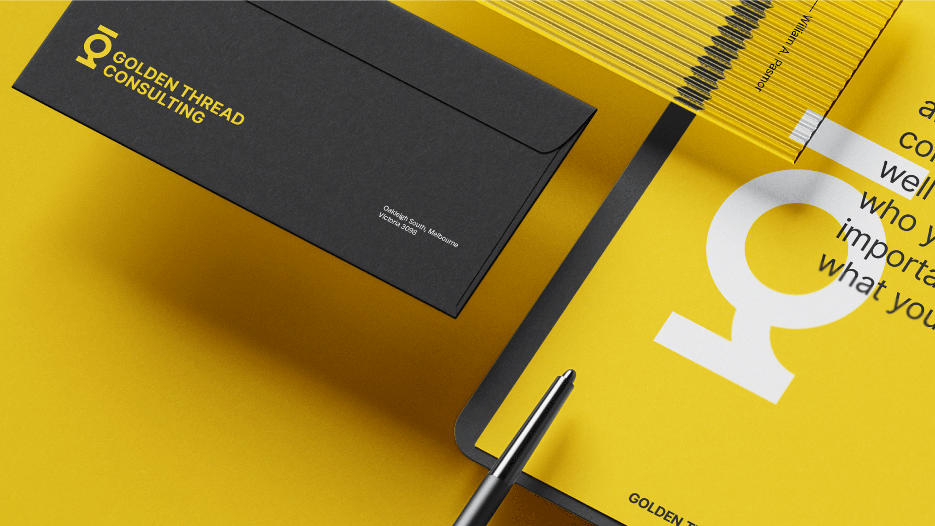
Golden Thread Consulting
Golden Thread Consultancy is a consulting service business offering organisational development, strategic planning, project design, positioning, coaching and capability.
The logo and brand identity aims to convey adaptability, collaboration, partnership, practicality, strategic thinking, strengthening and differentiation. The logo design features a strong logo mark that creatively incorporates simple geometric shapes — a circle and a rectangle — to form the letter 'g', symbolizing perfection, wholeness, and harmony. This visual representation encapsulates Golden Thread Consulting's distinctive approach, showcasing their commitment to seamlessly integrating top consultation practices and delivering comprehensive transformative solutions that set them apart in the industry.

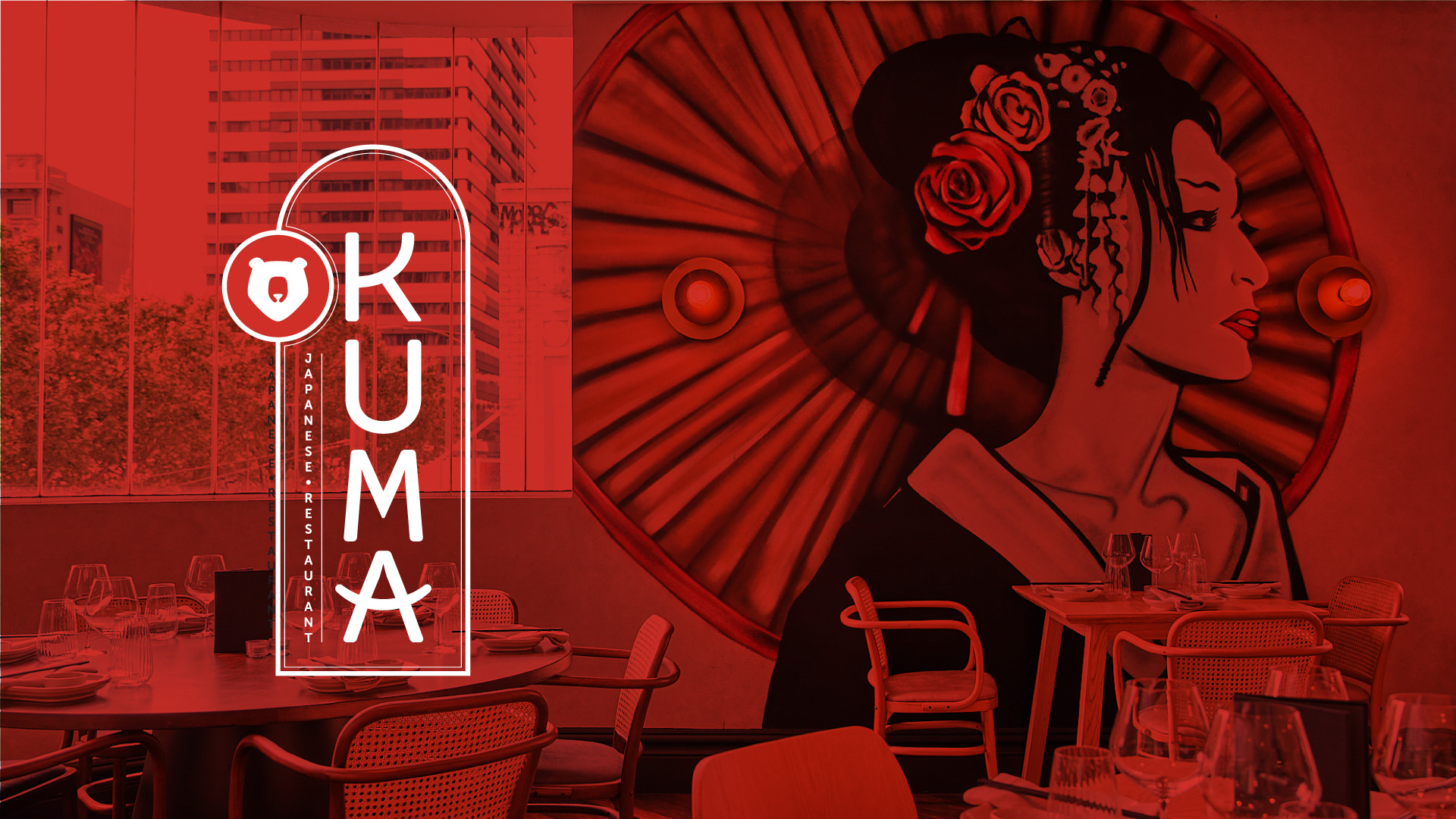
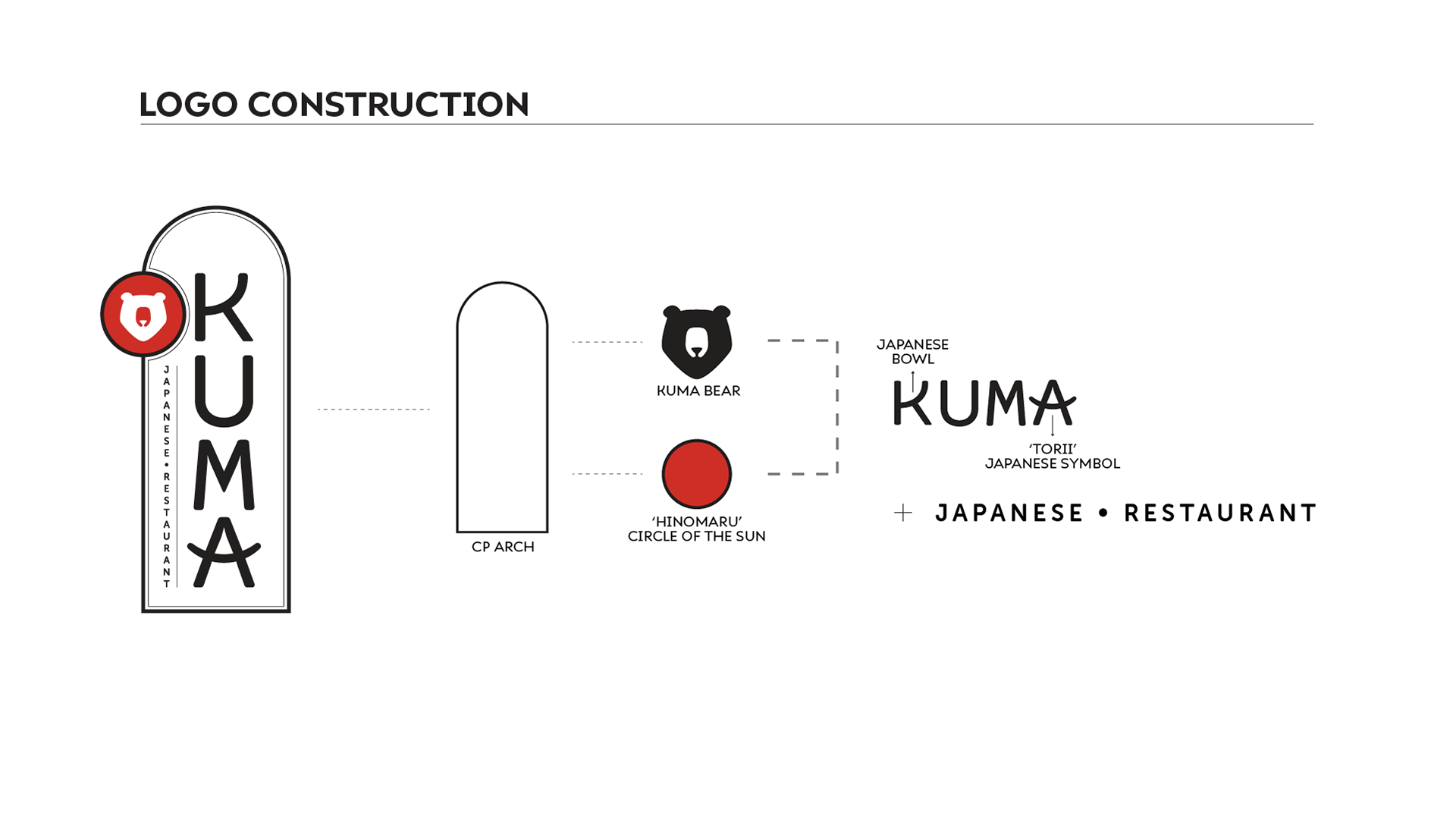
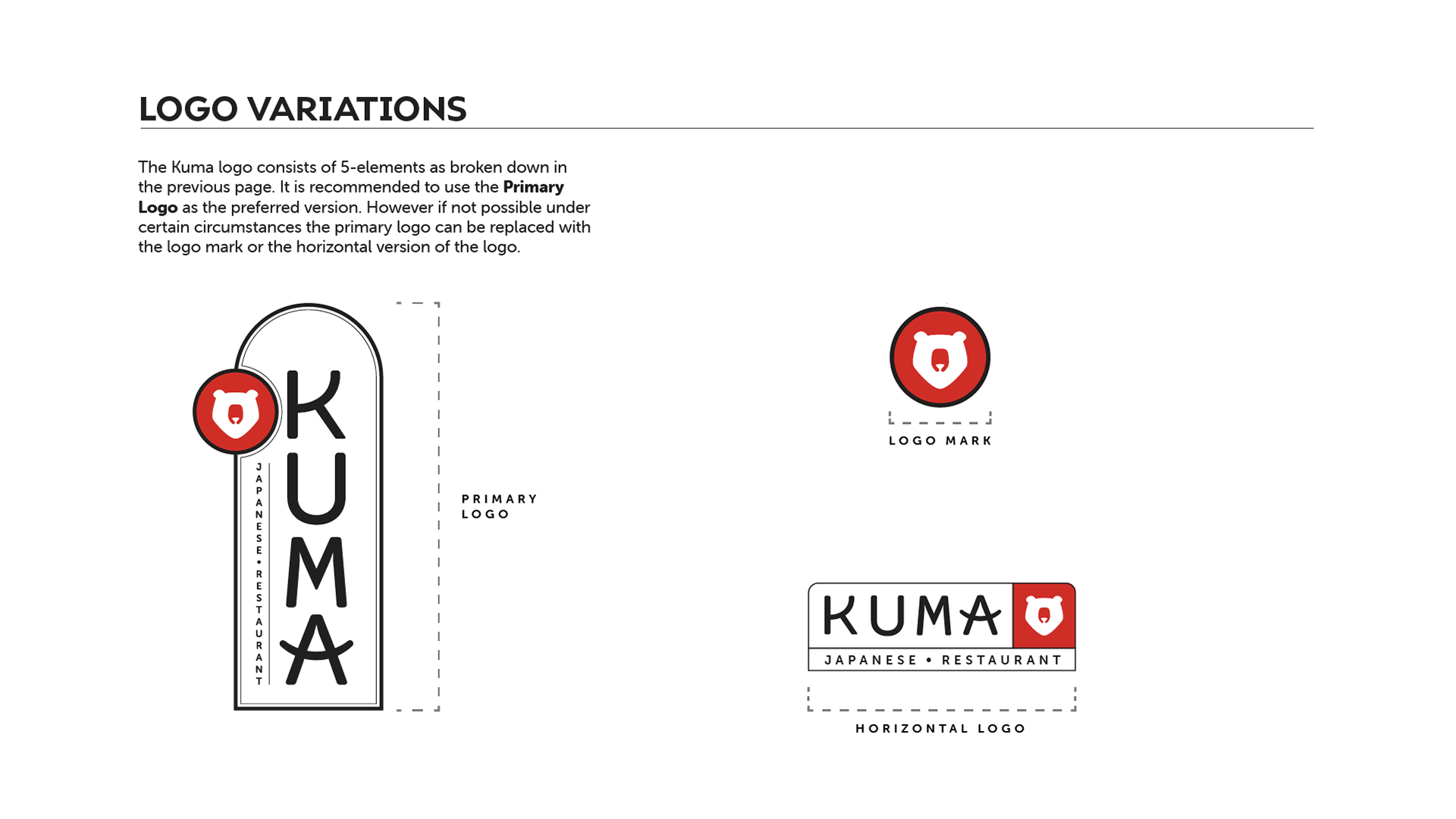
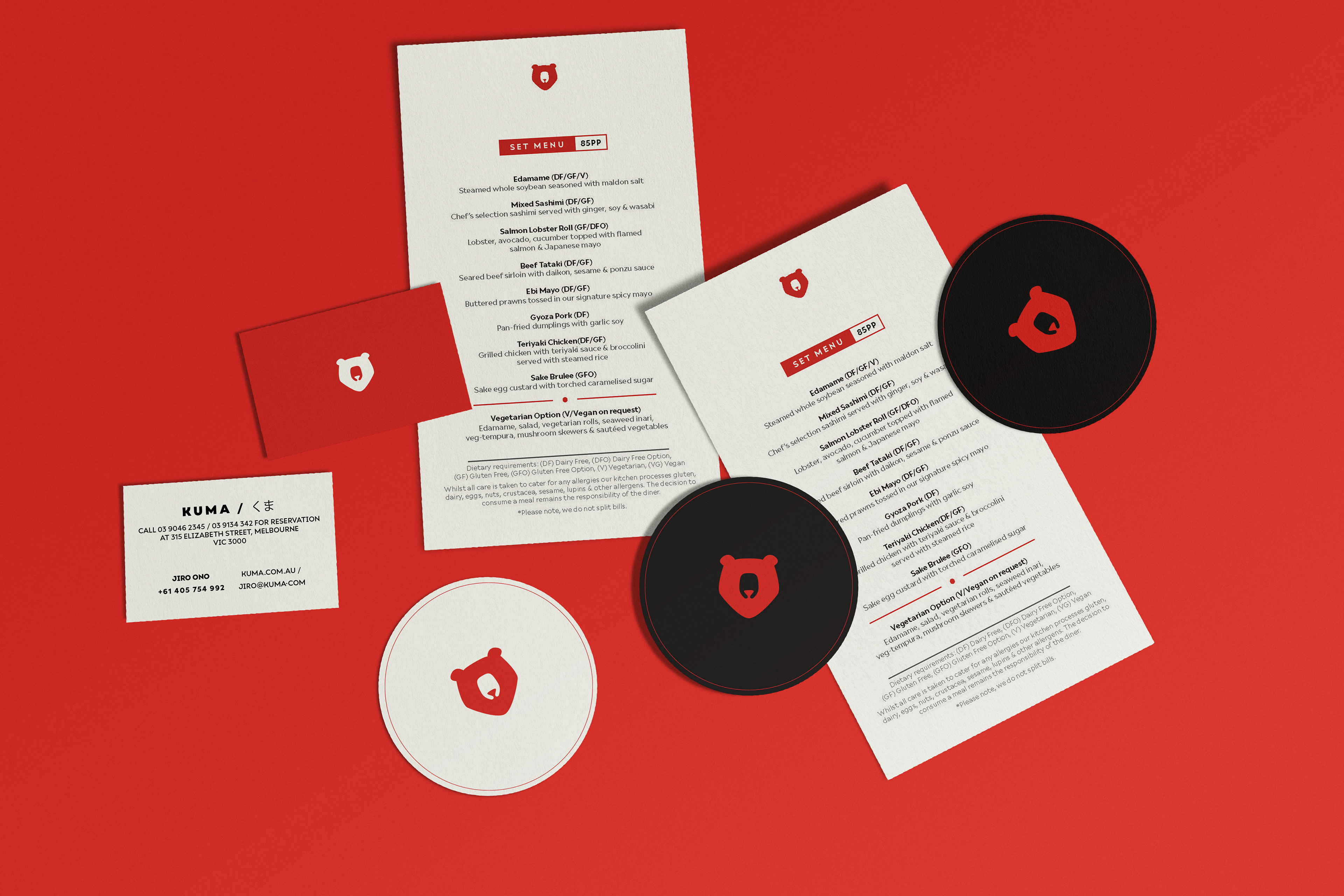
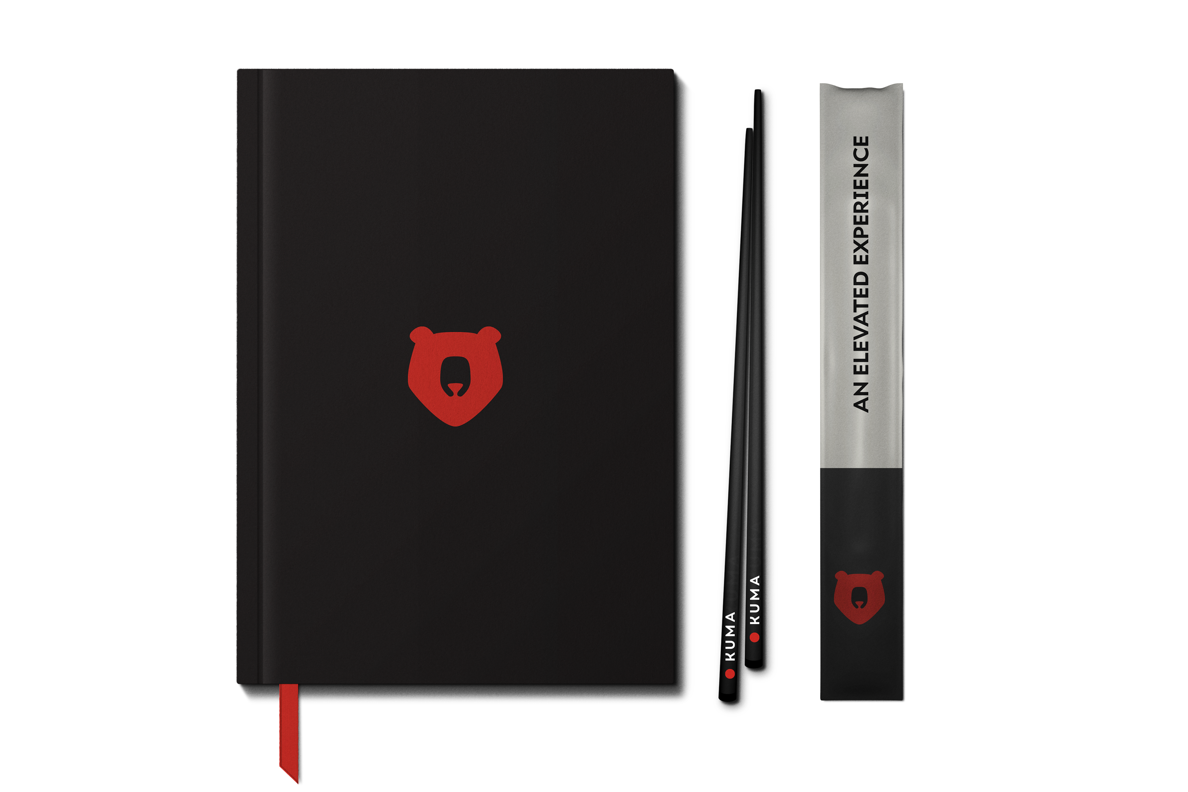
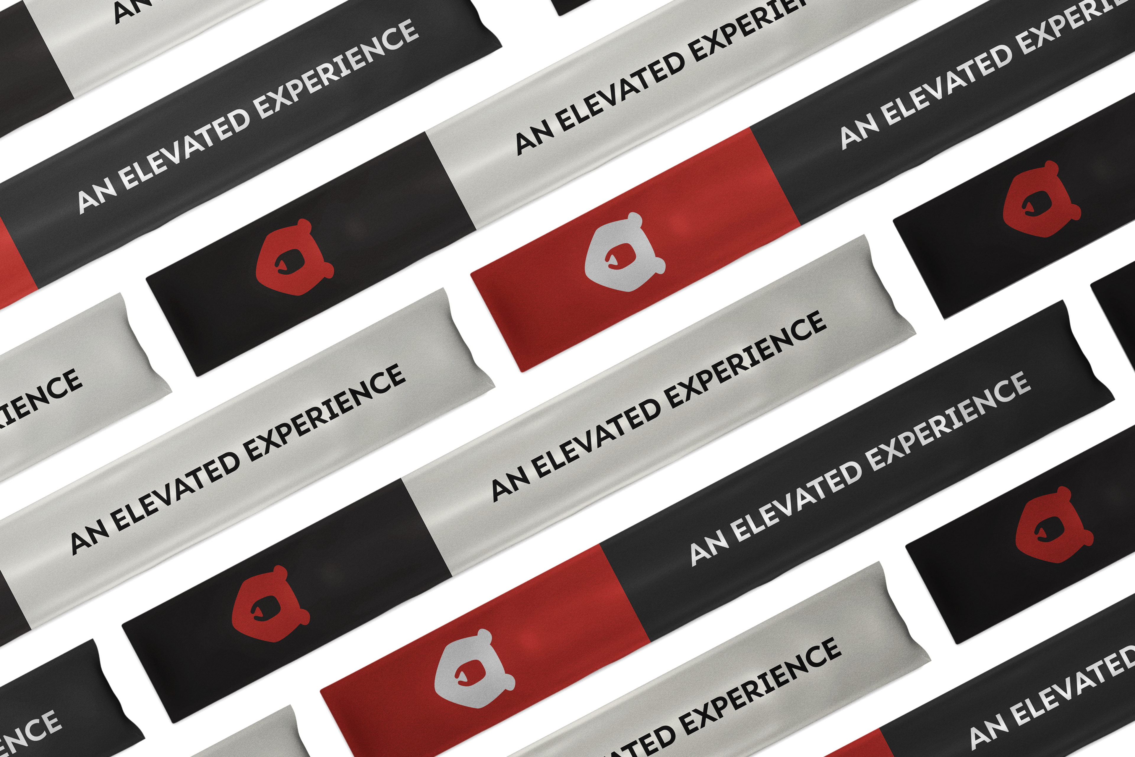
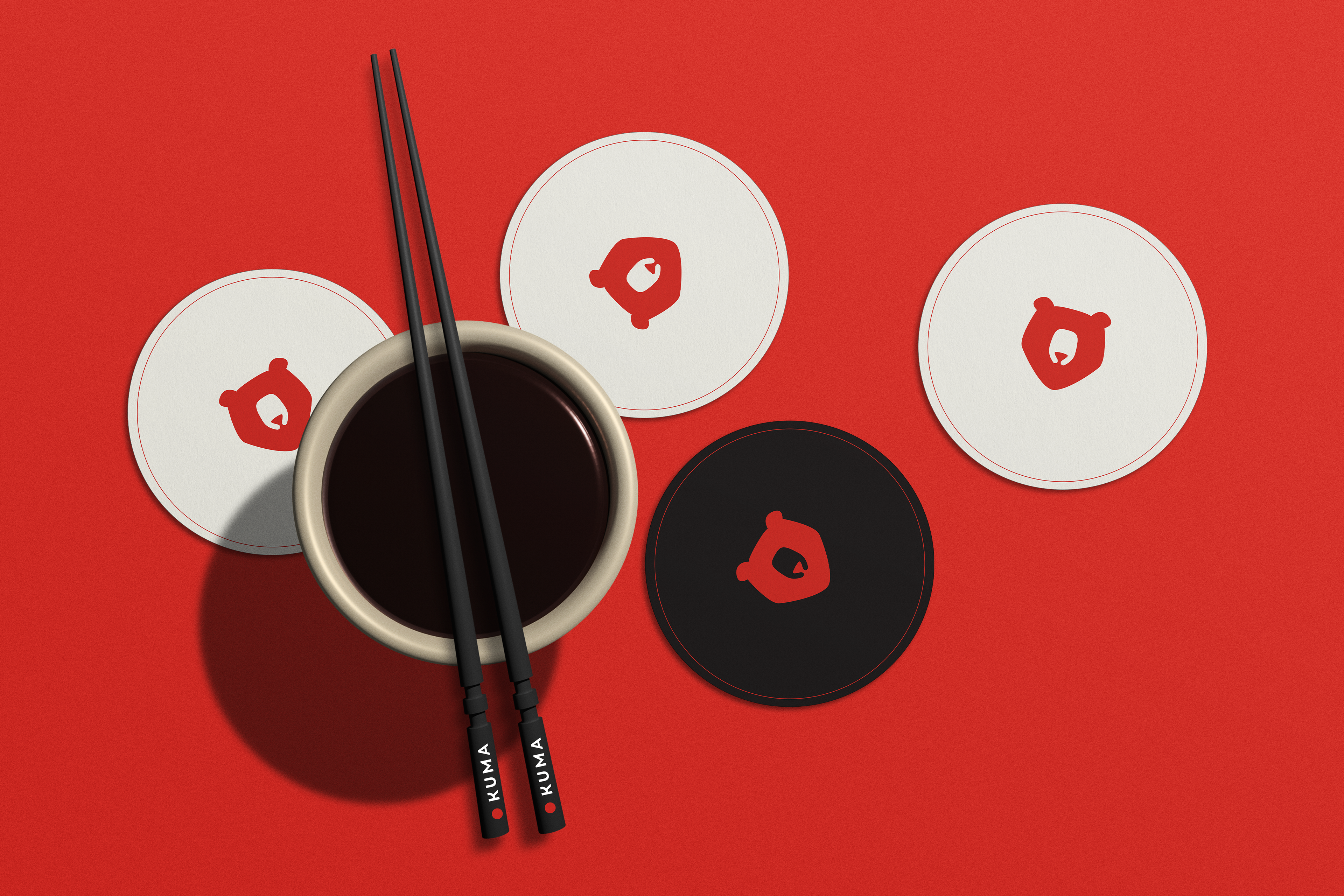
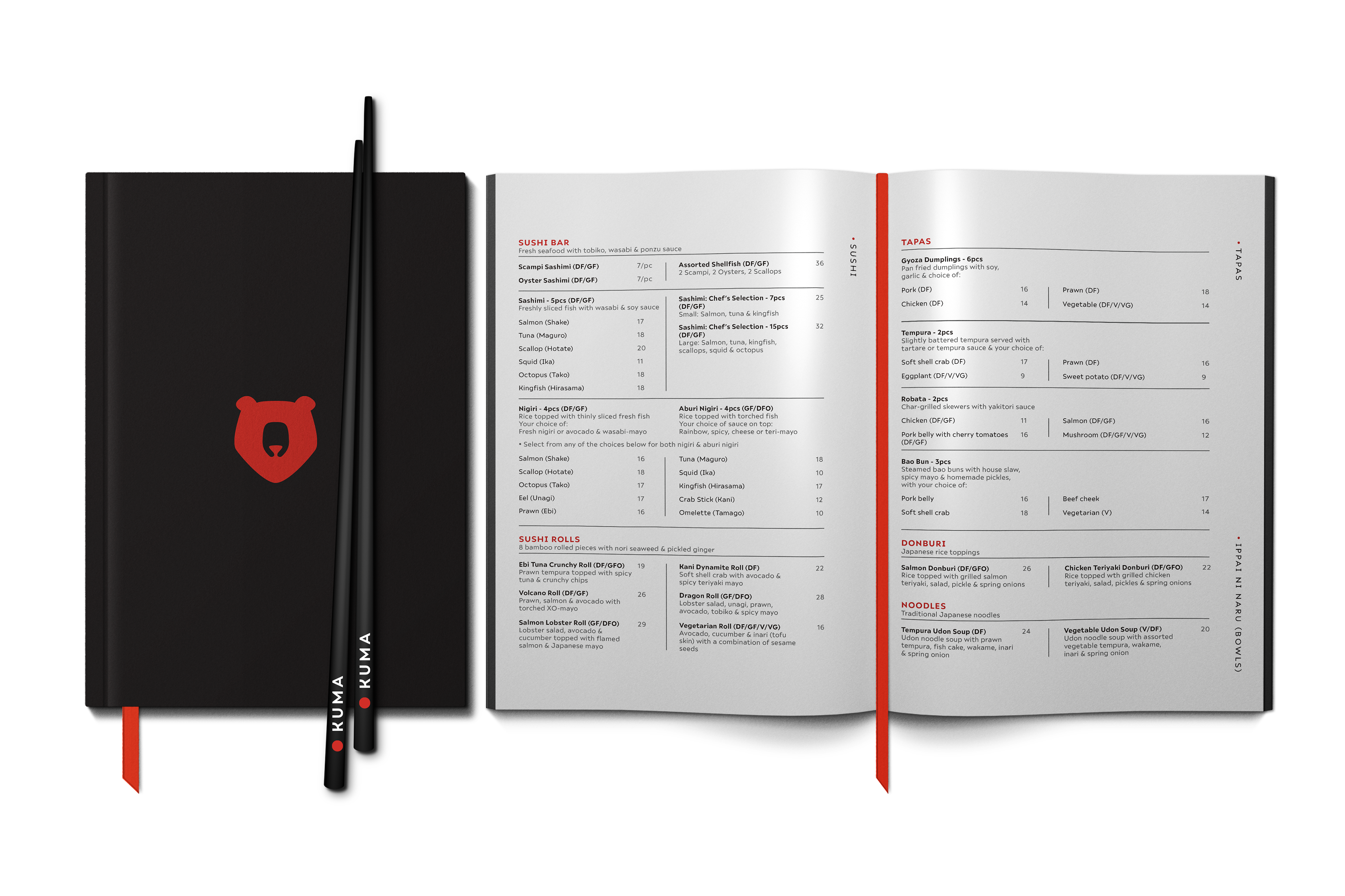
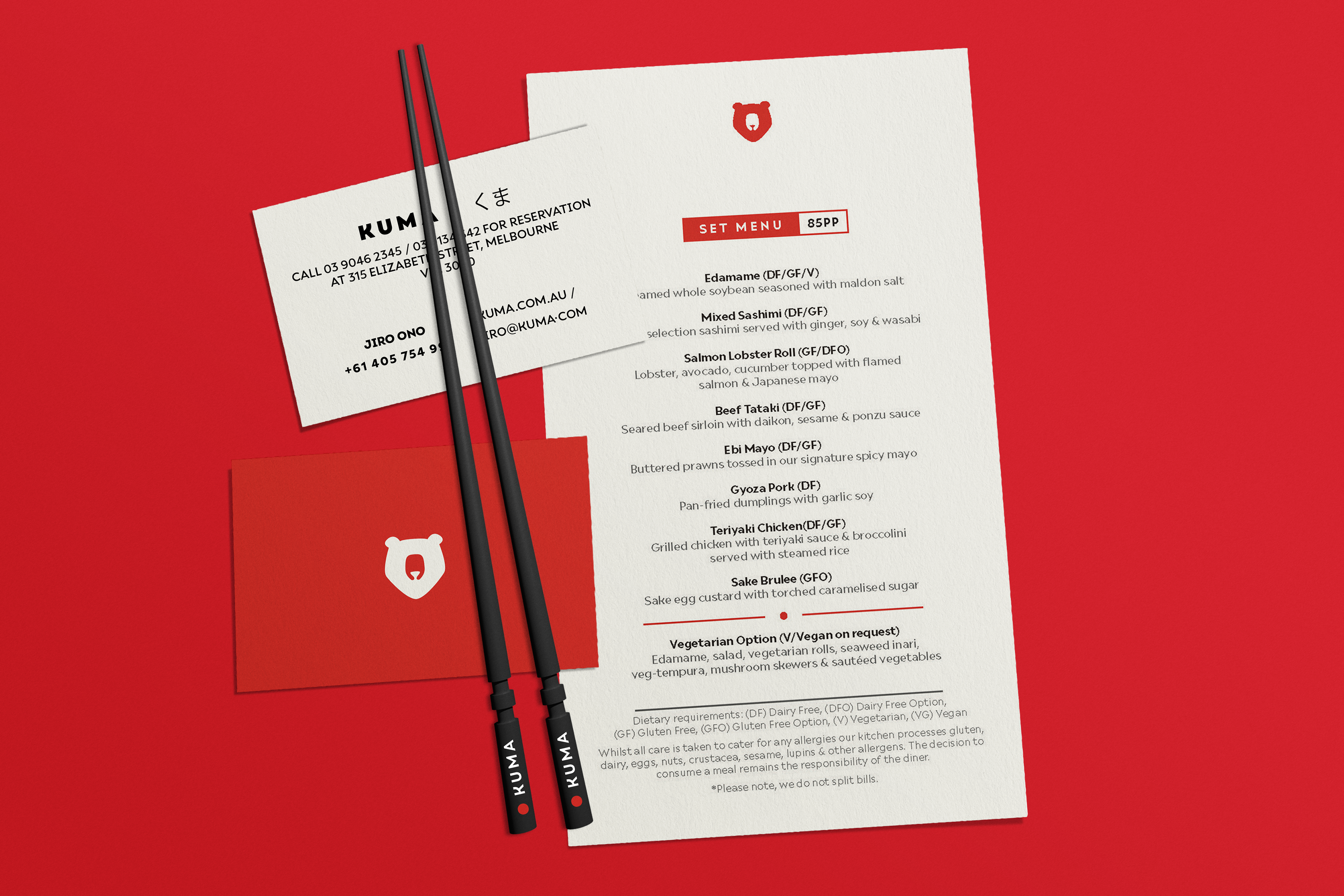
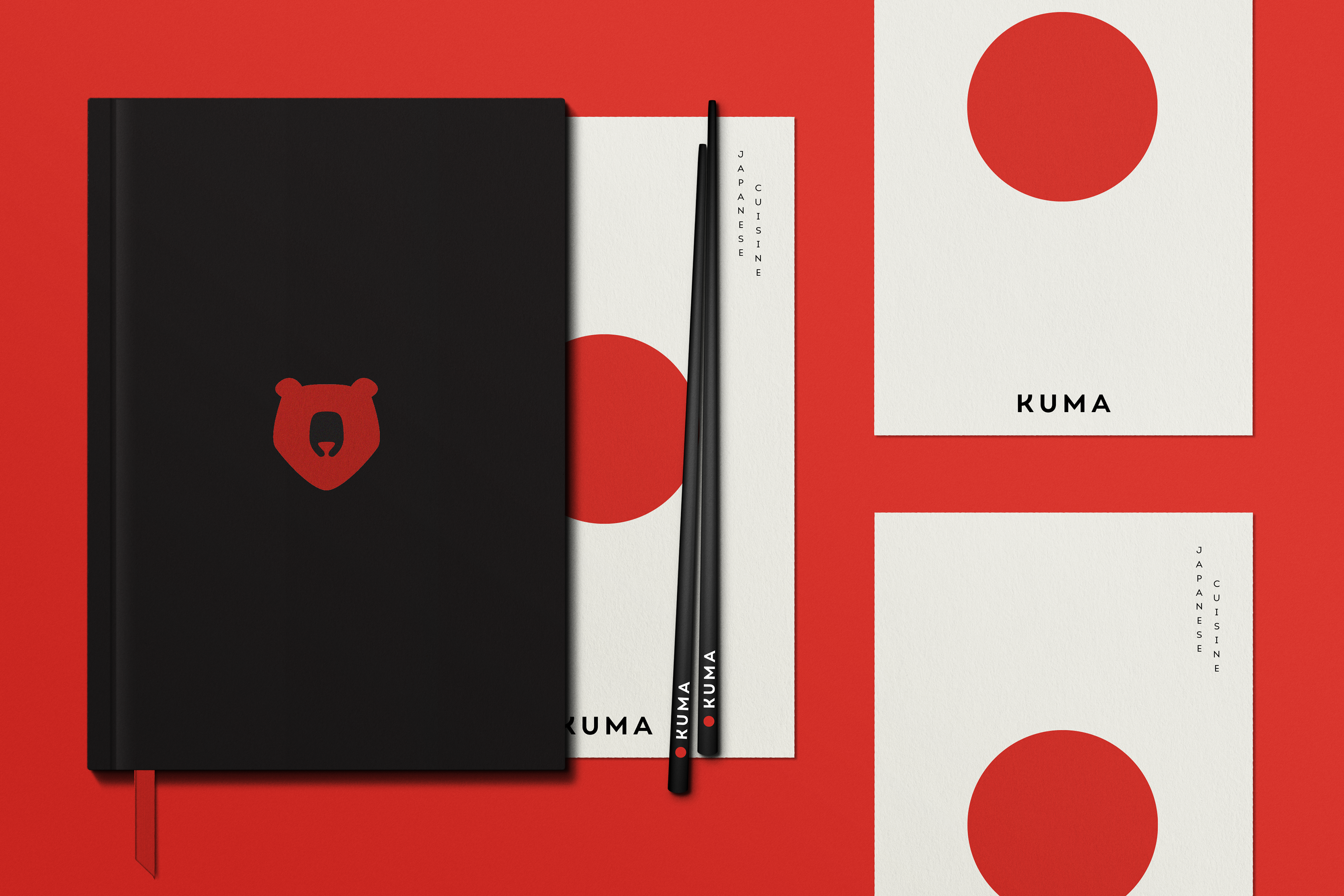
Kuma Japanese Restaurant
Kuma offers an elevated Japanese dining experience in the heart of the iconic Melbourne Central.
Logo Construction: The logo of Kuma was created by combining elements of the building's arch where the restaurant is situated, the Kuma (meaning bear in Japanese), and the red circle symbolizing the Hinomaru (circle of the sun). The wordmark features a curved letter K, representing a Japanese bowl, and an arched letter A, symbolizing the Torii (a traditional Japanese symbol).
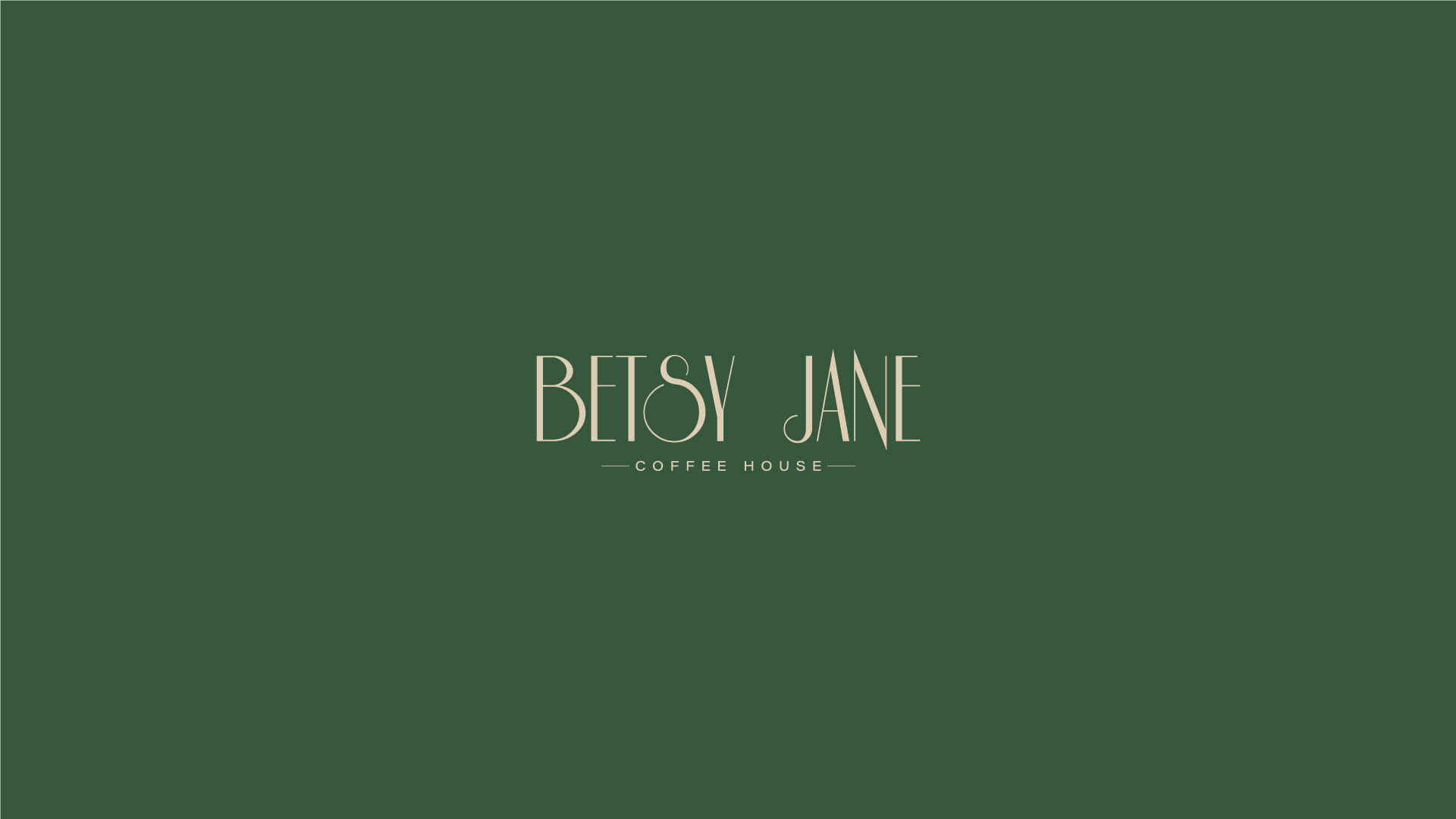
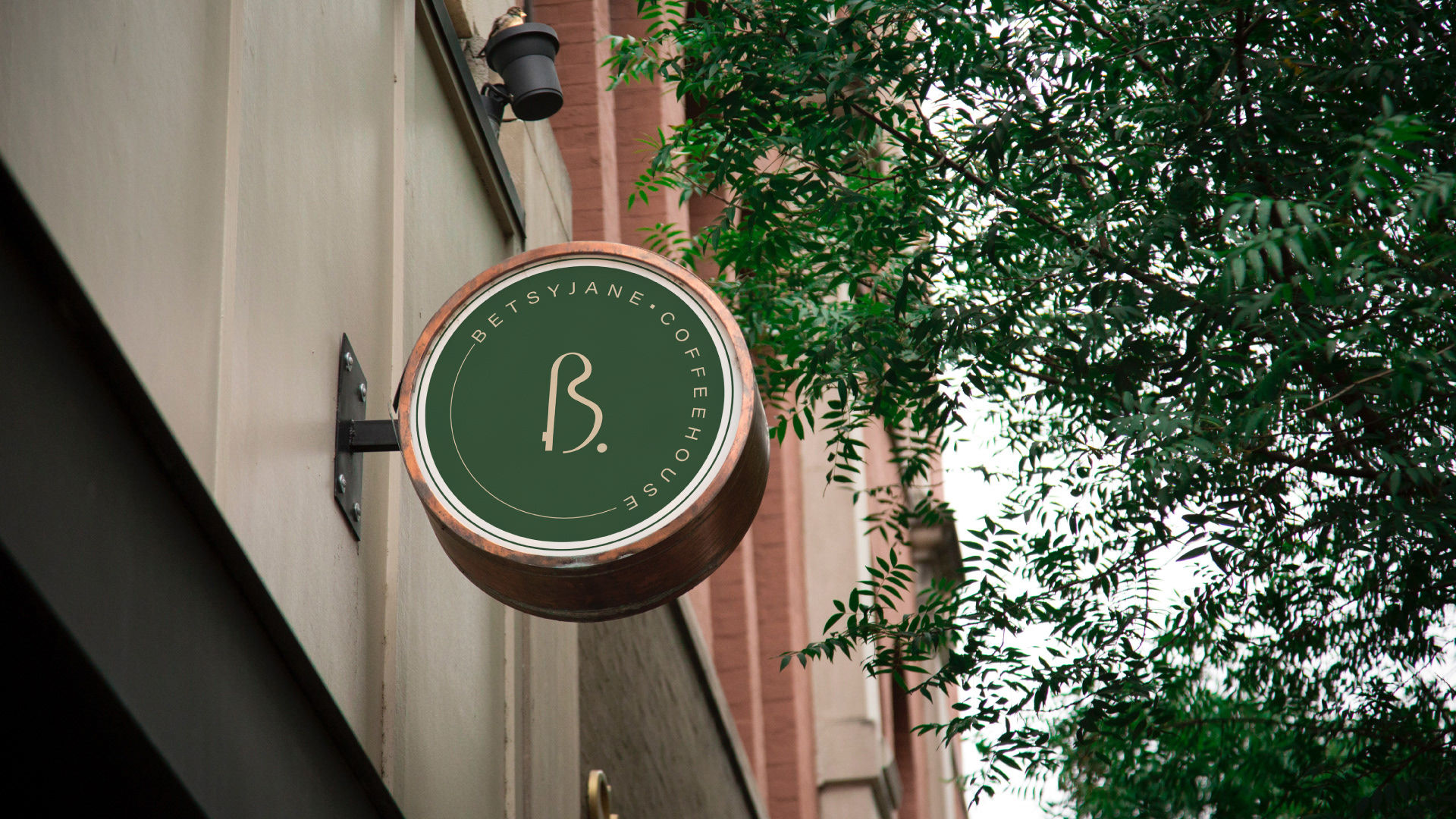
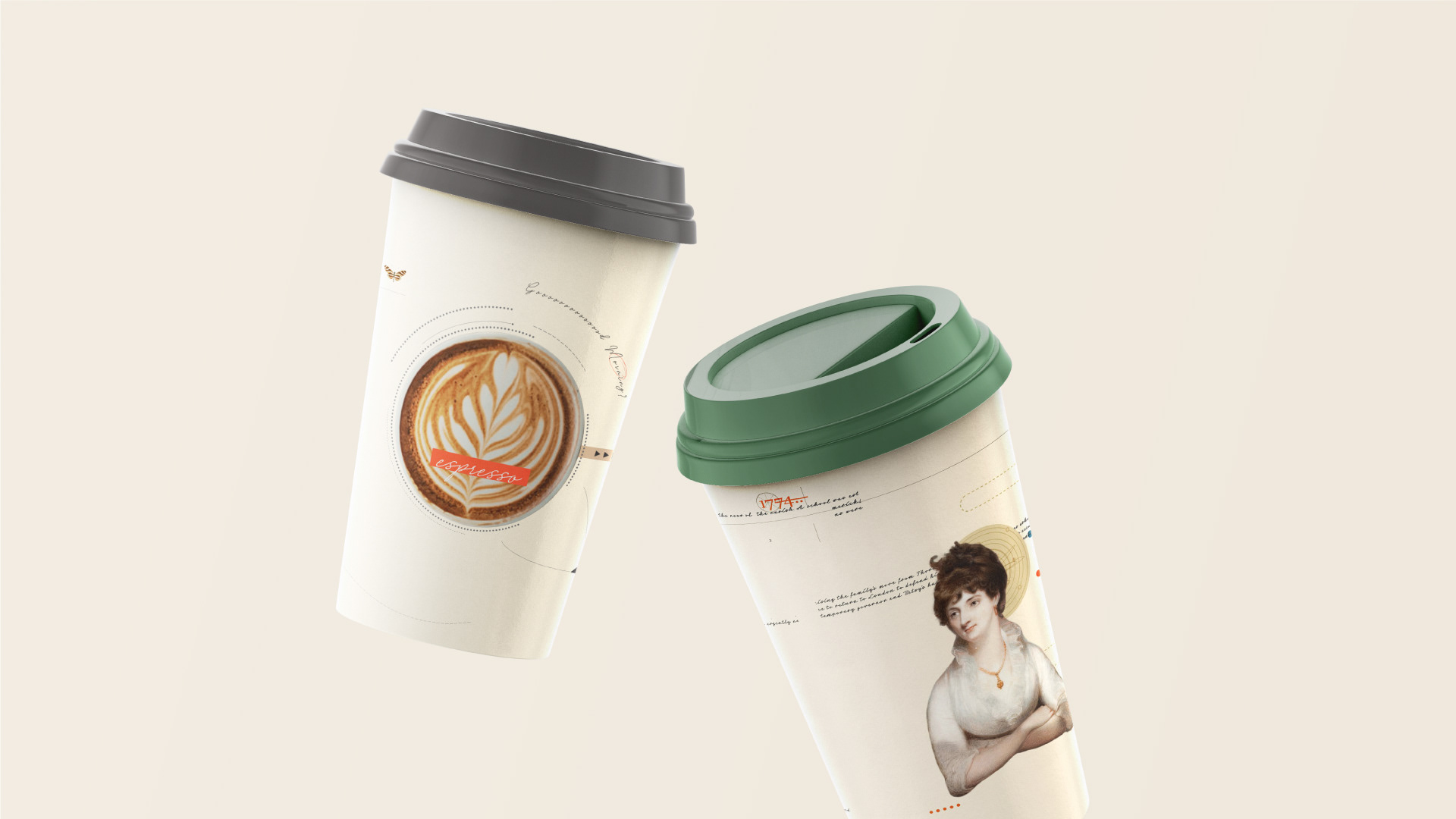
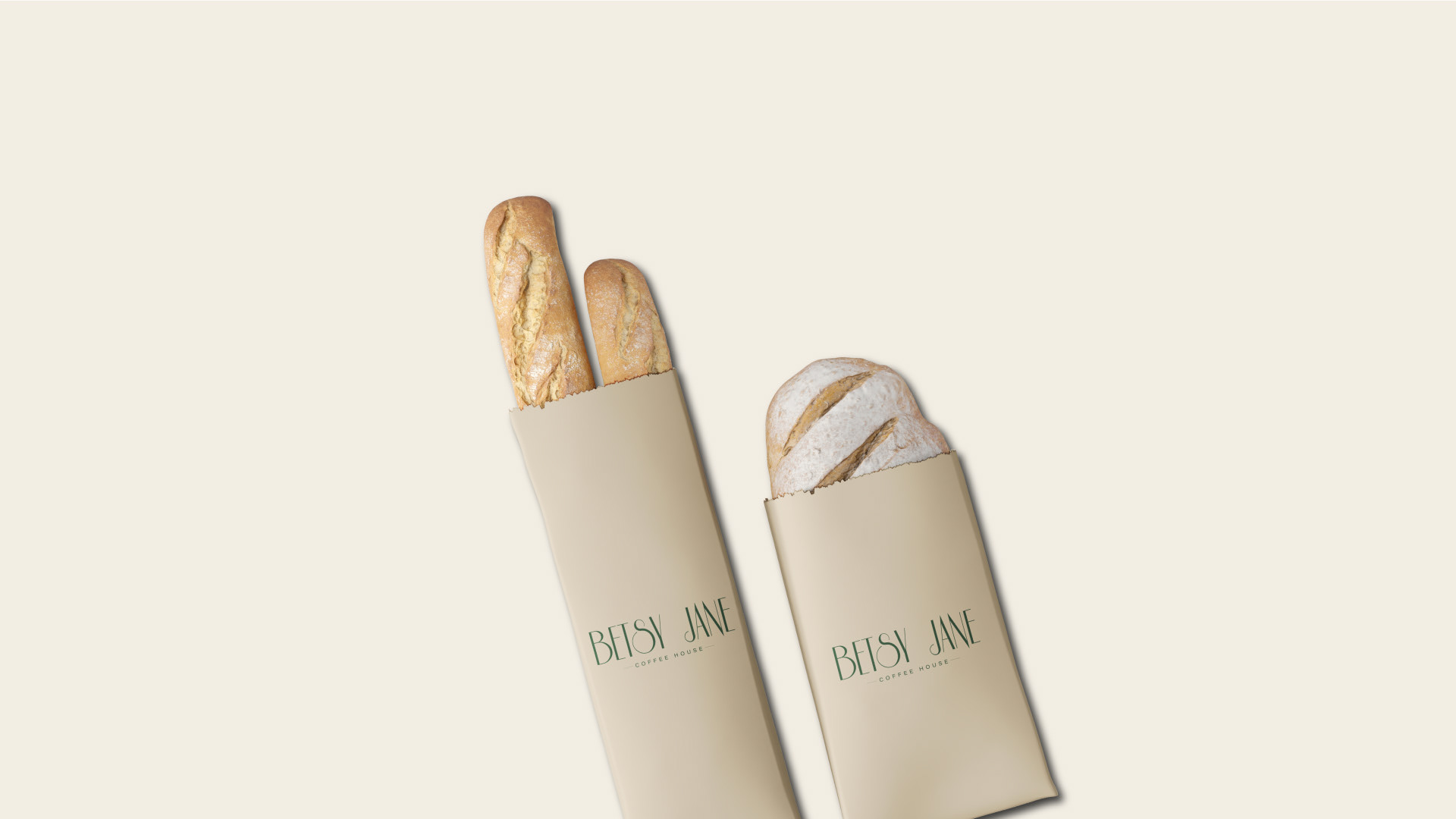
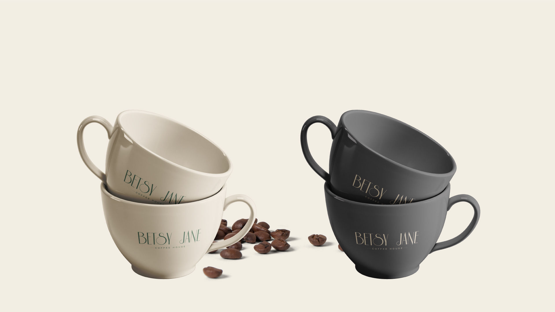
Betsy Jane Coffee House
Logo Construction: Betsy Jane logo is designed to encompass all of the rational components, such as proportions, scaleability, optical ad adjustments & reproduction. The aim of the logo design was to capture the brand's personality of being sophisticated, elegant, glamourous & charming as well as giving it a vintage era essence.


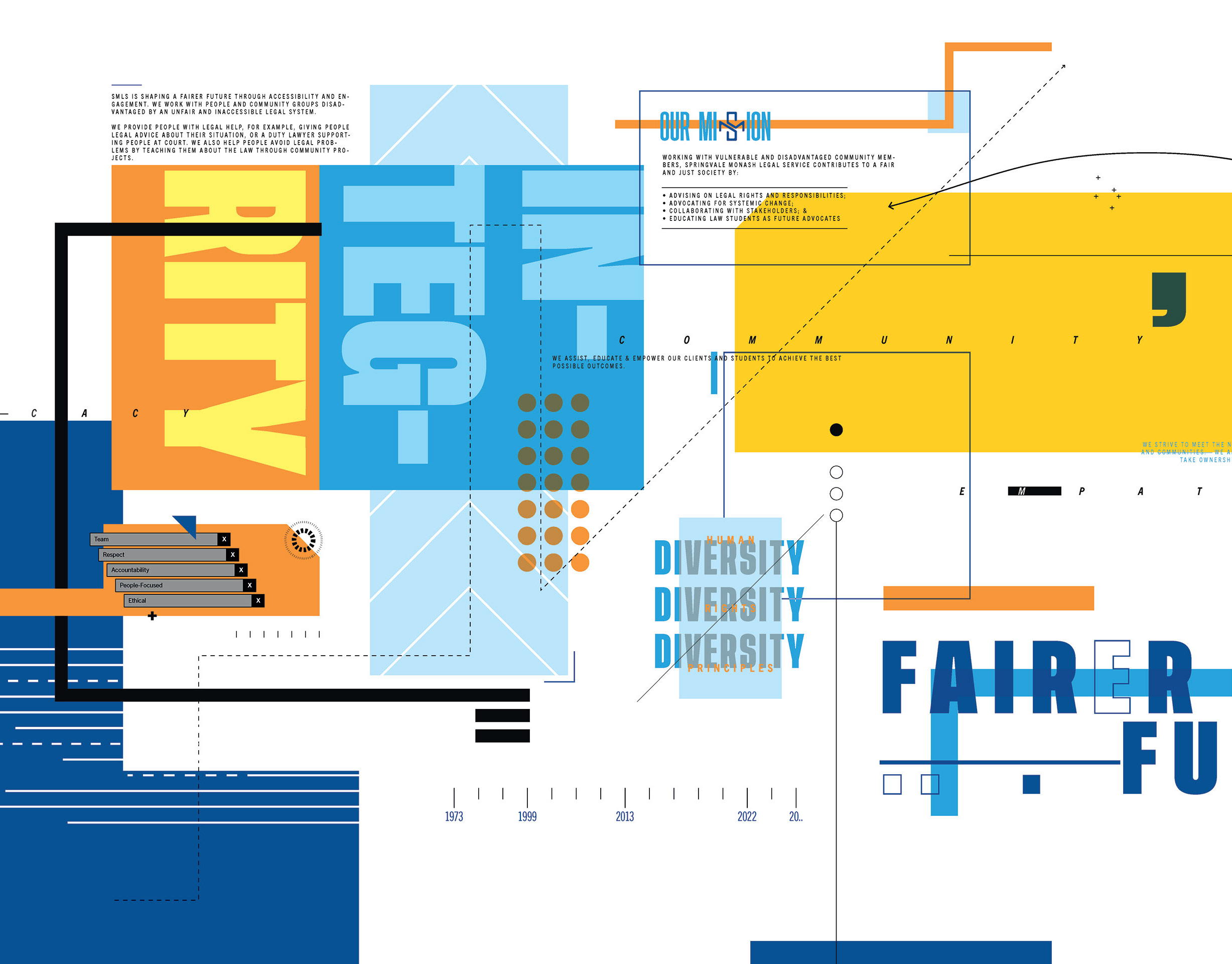
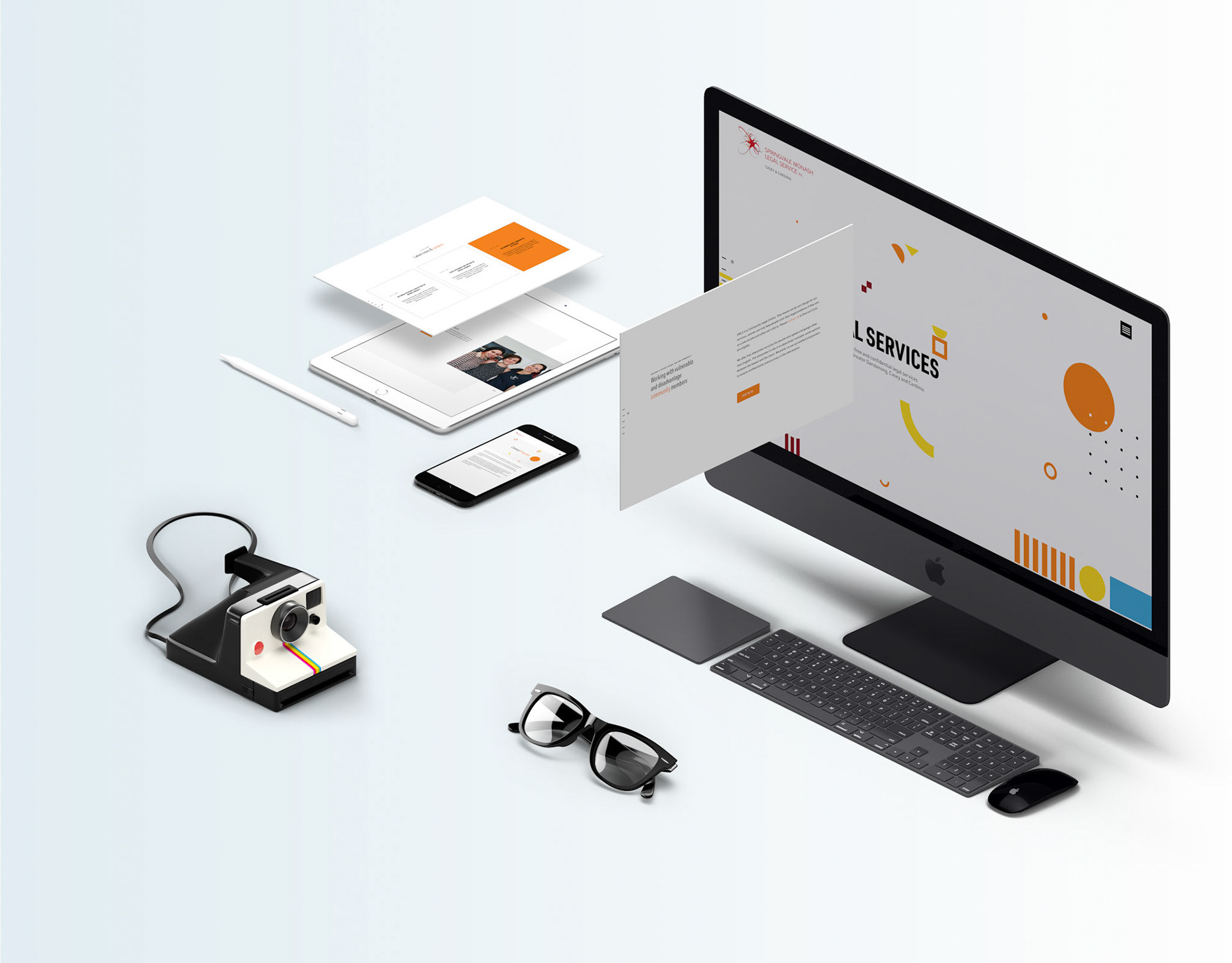
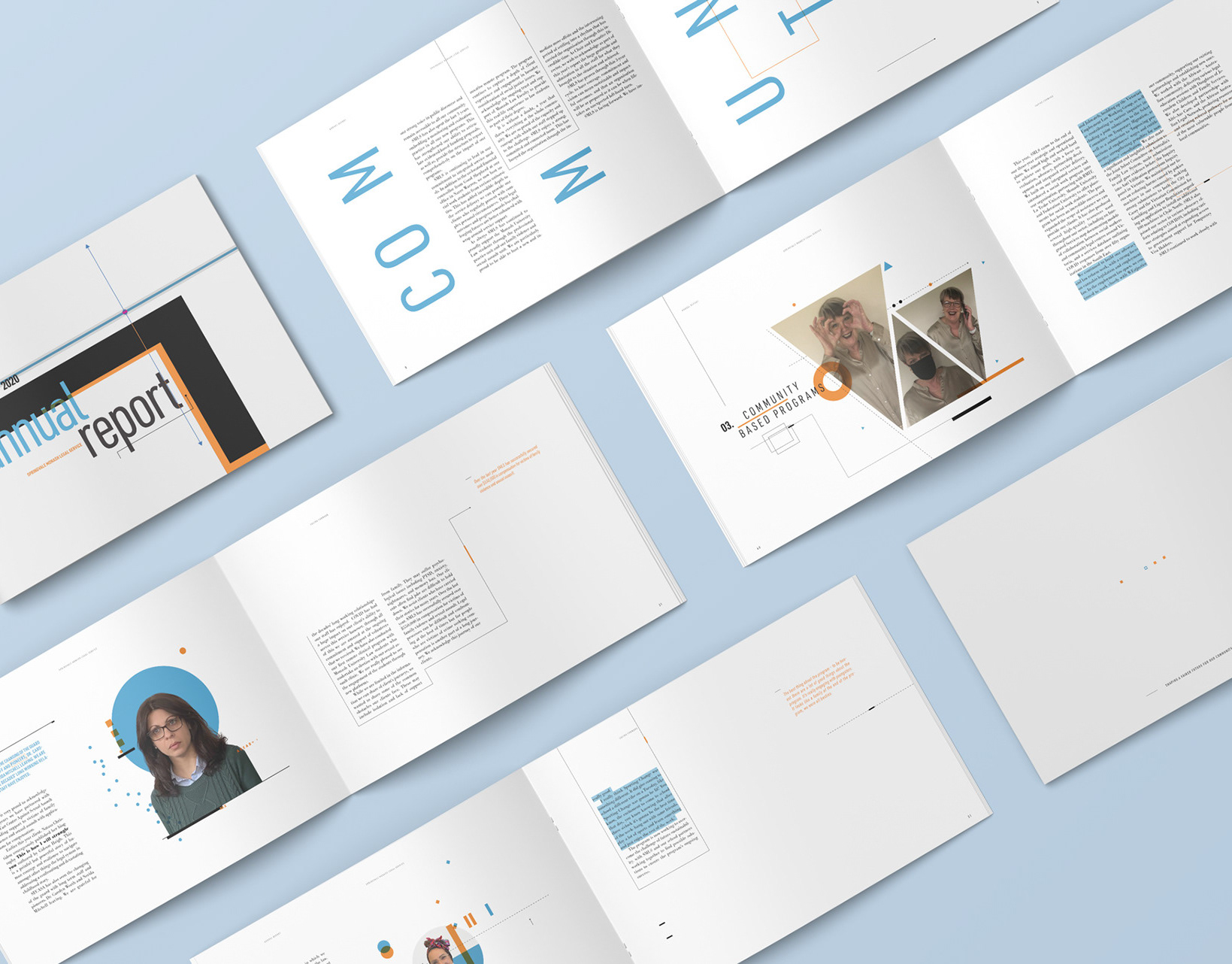
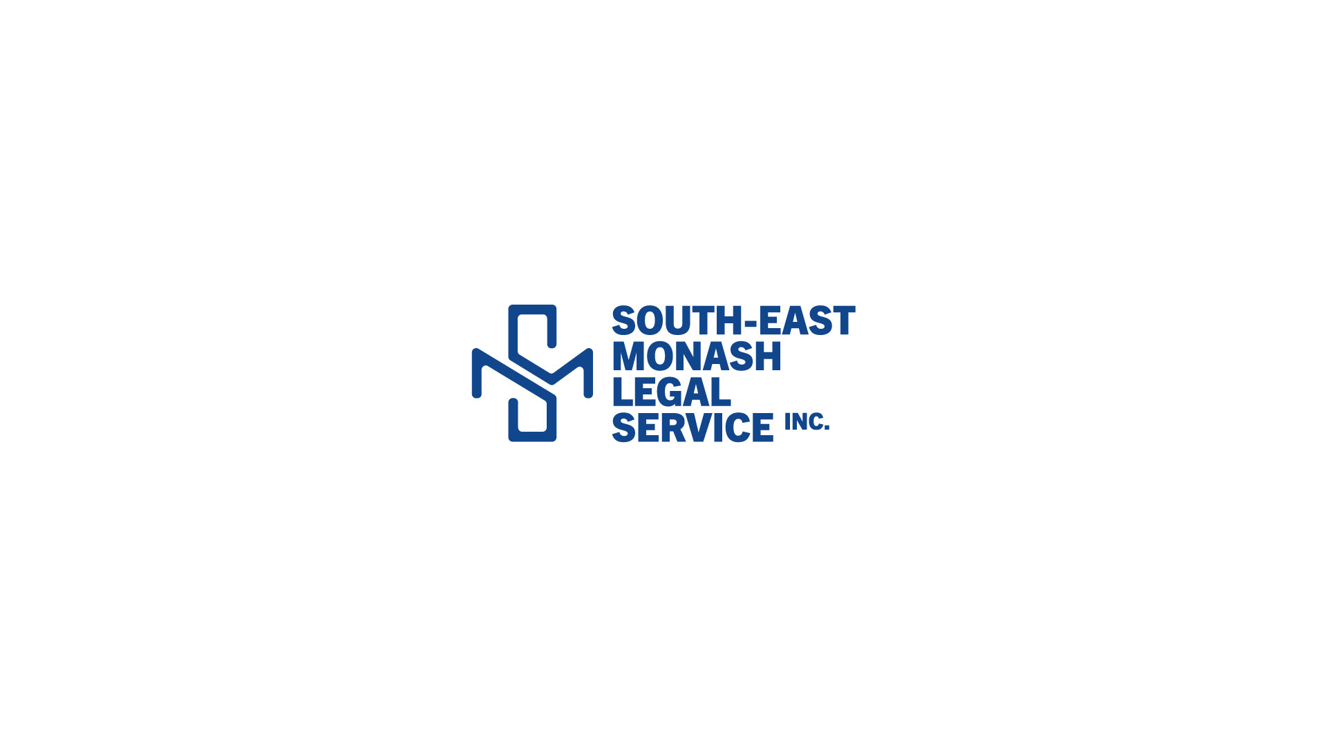
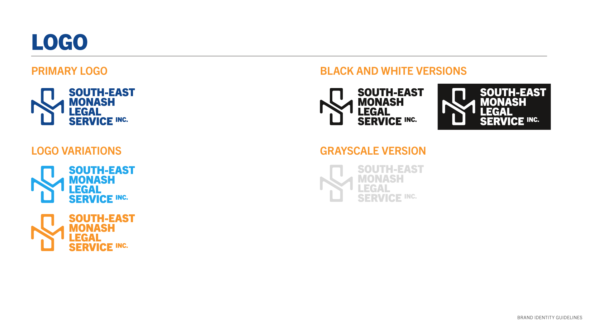
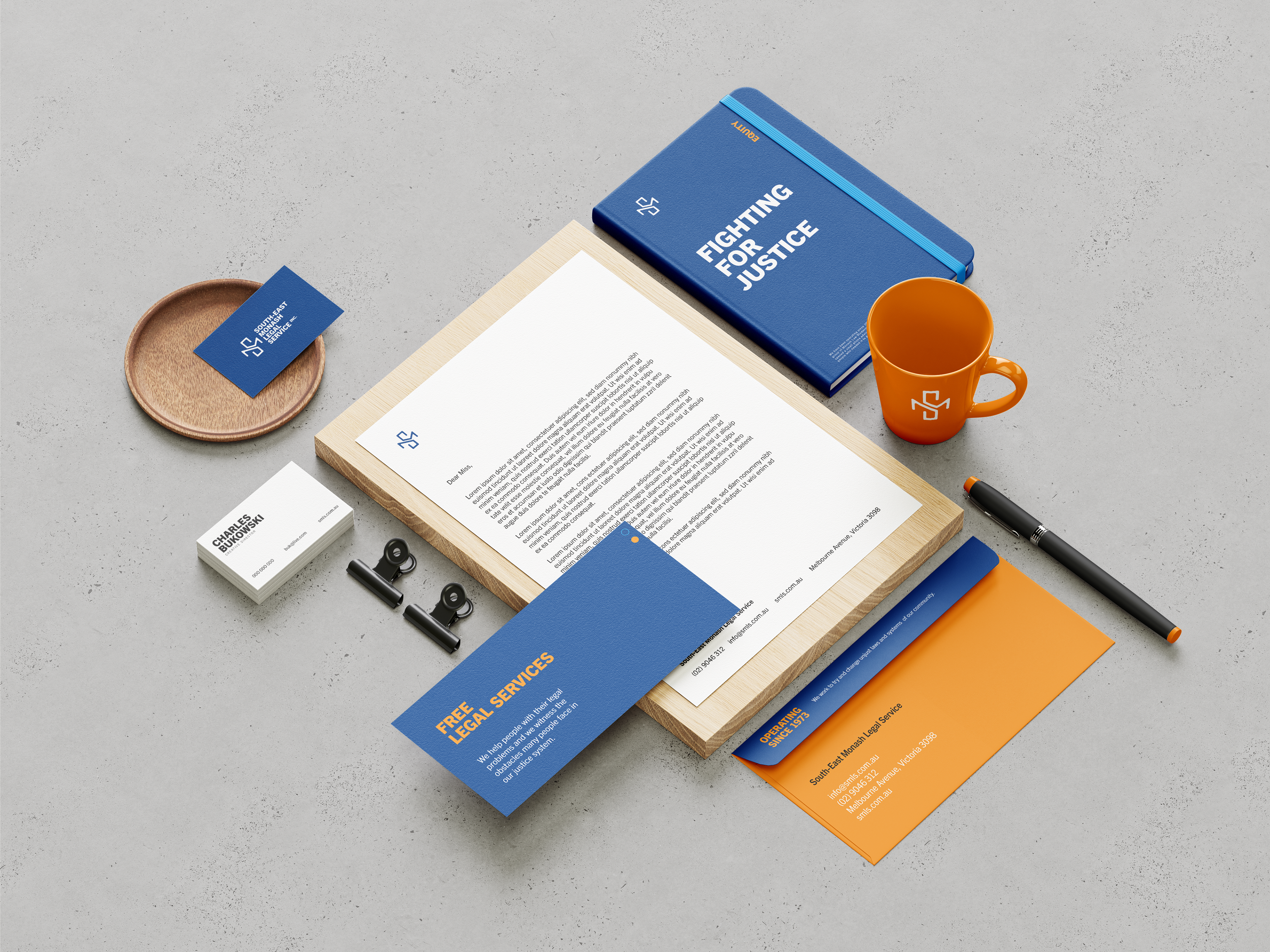
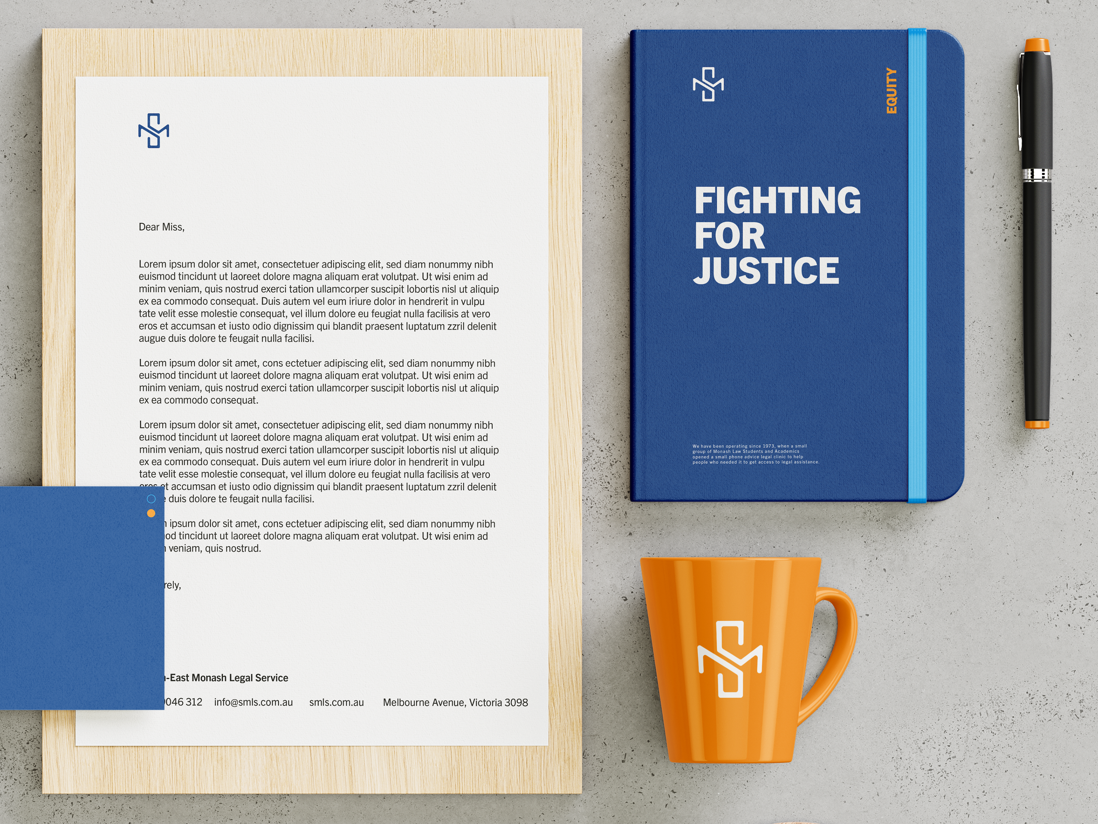
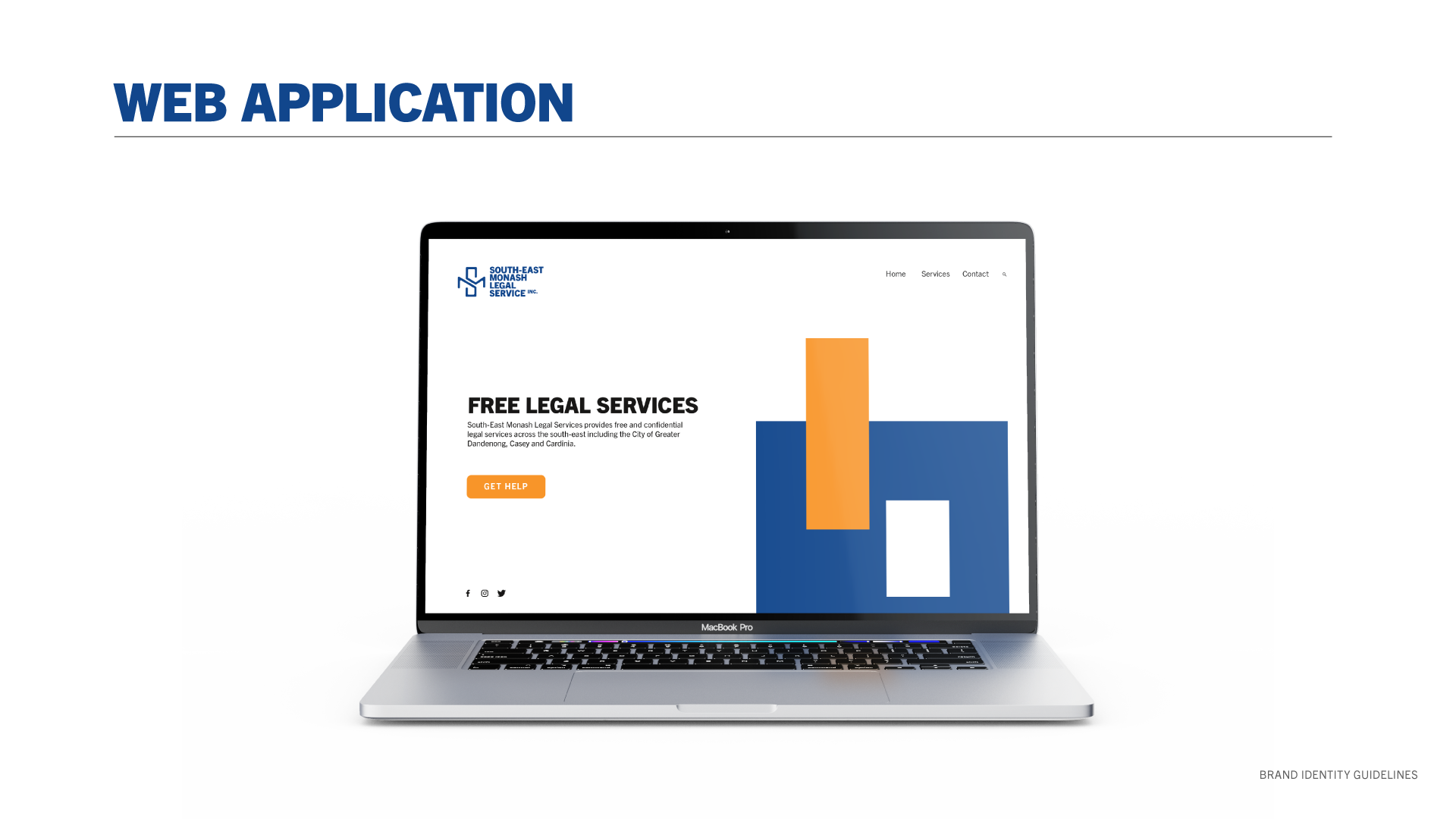
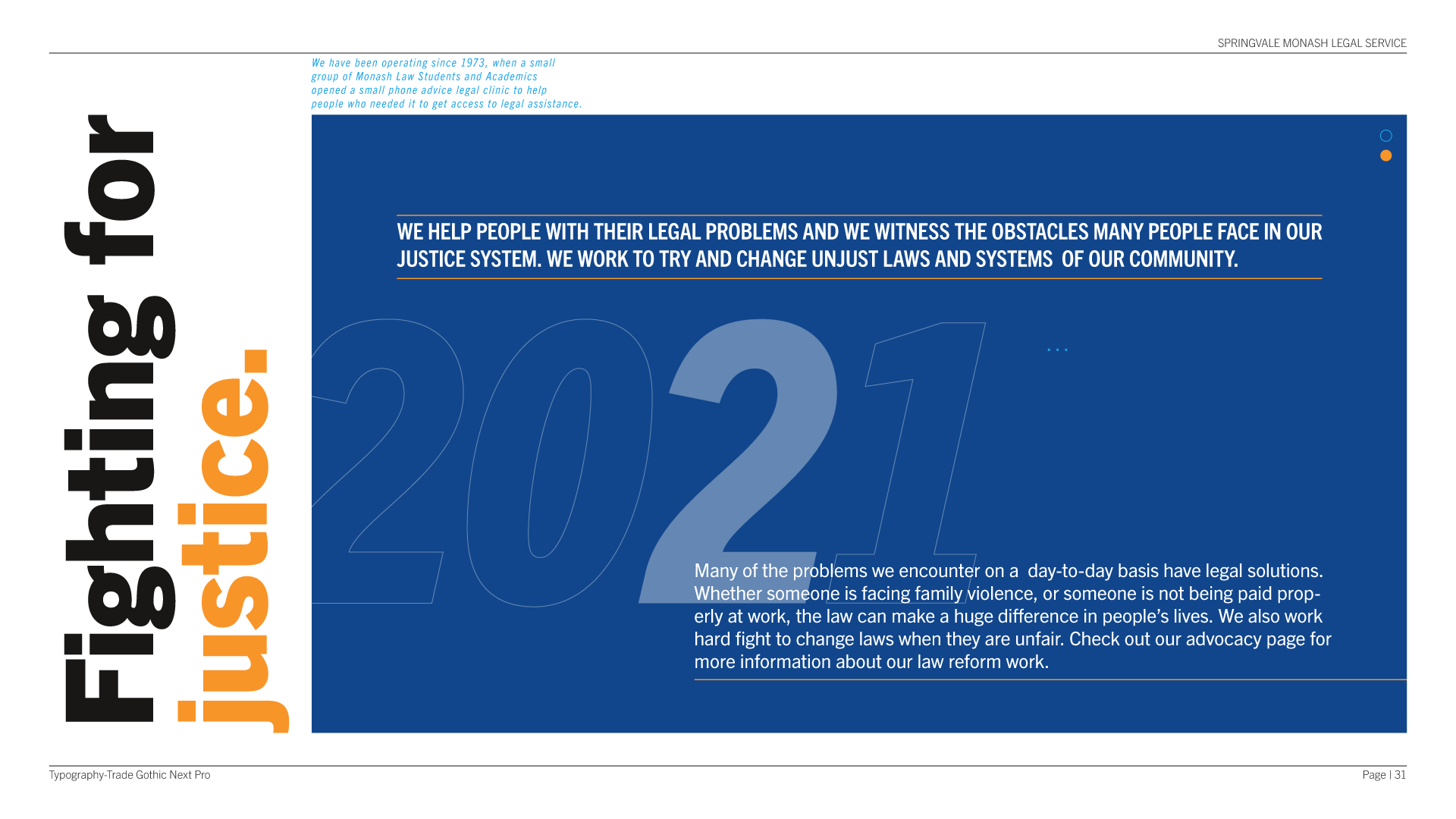
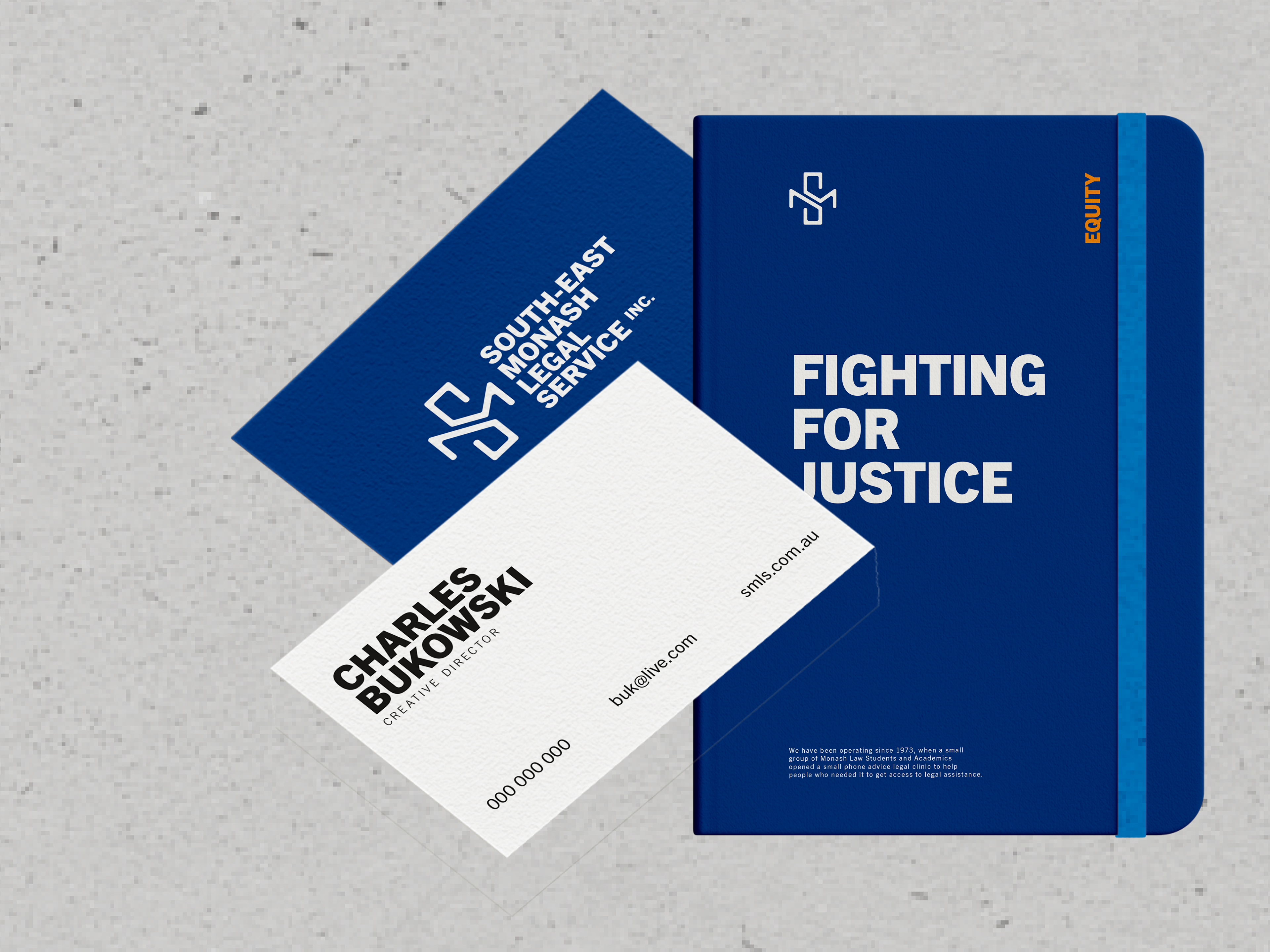
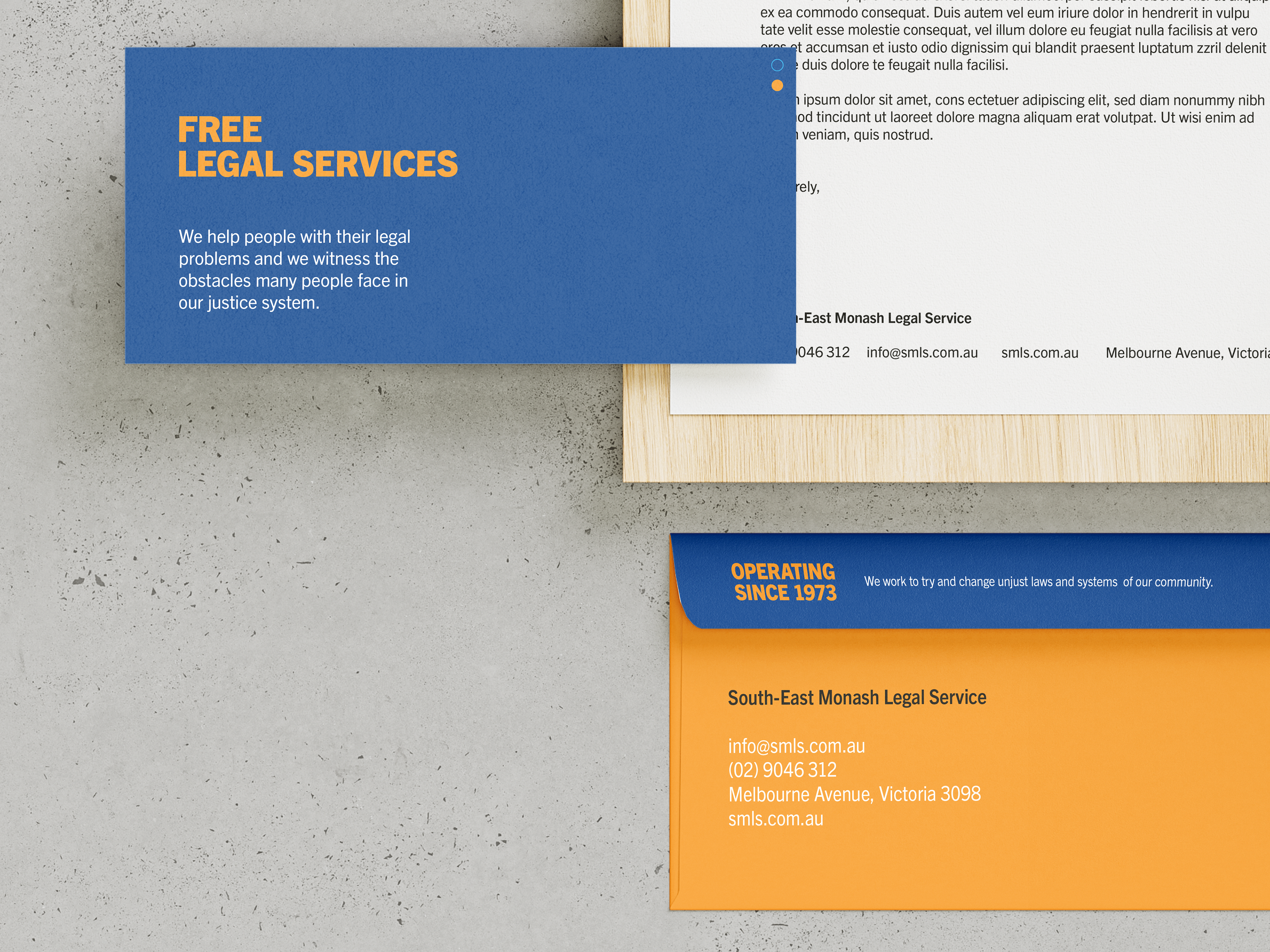
South-East Monash Legal Service Inc.
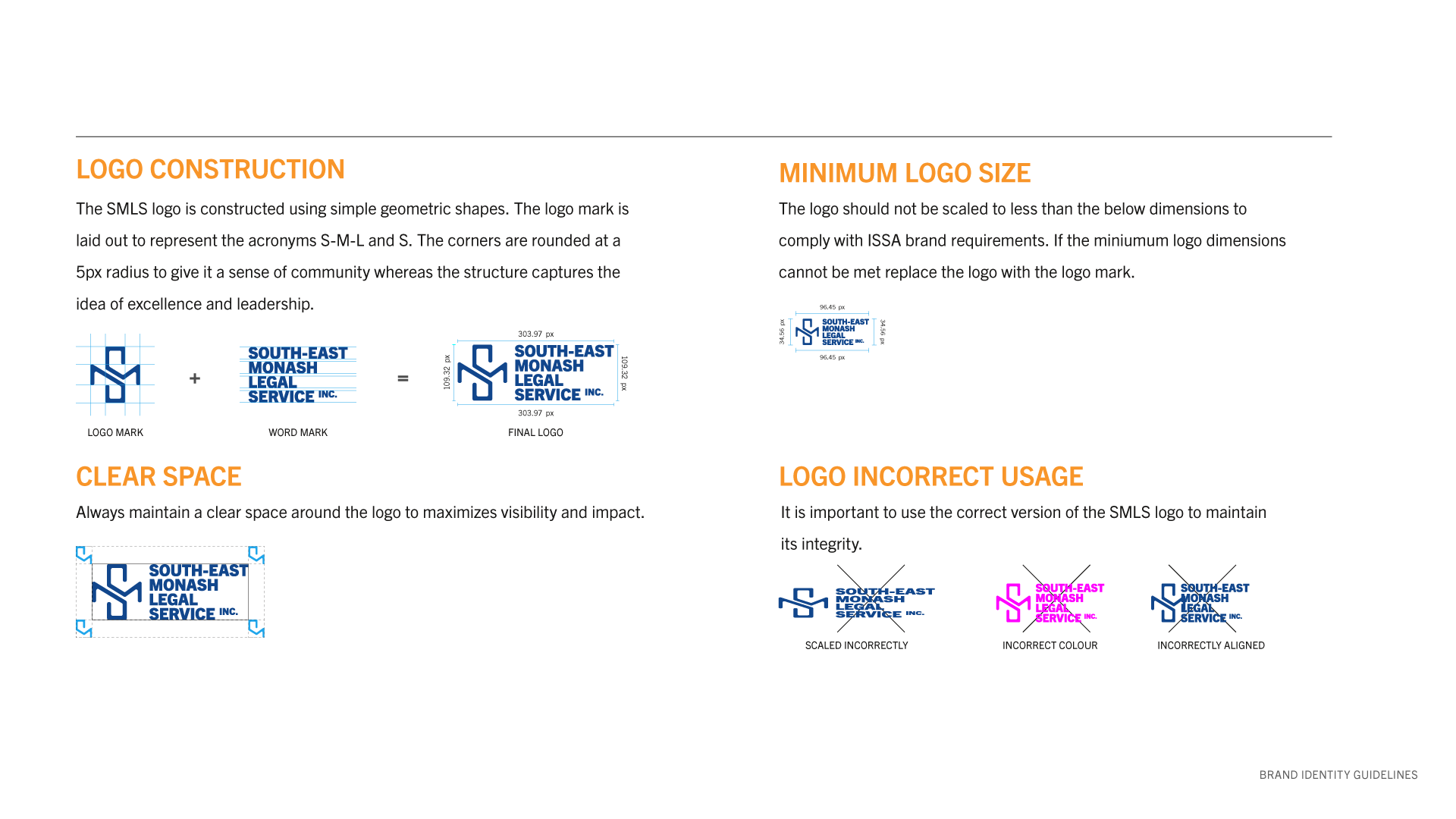
Logo Construction: The SMLS logo is constructed using simple geometric shapes. The logo mark is laid out to represent the acronyms S-M-L and S. The corners are rounded at a 5px radius to give it a sense of community whereas the structure captures the idea of excellence and leadership.


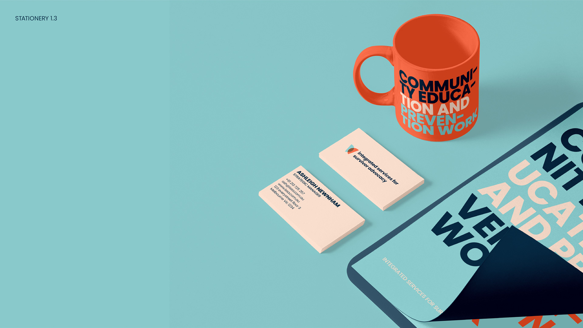
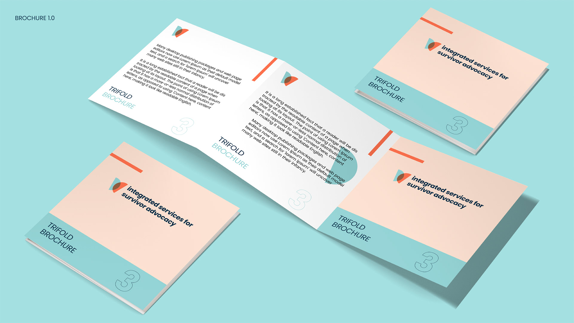
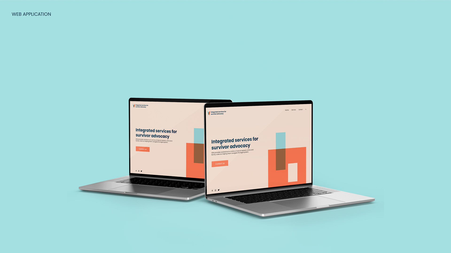
Integrated Services for Survivor Advocacy (ISSA)
Integrated Services for Survivor Advocacy (ISSA) is a collaborative brand partnership between South-East Monash Legal Service Inc. (SMLS) & South Eastern Centre Against Sexual Assault & Family Violence (SECASA).
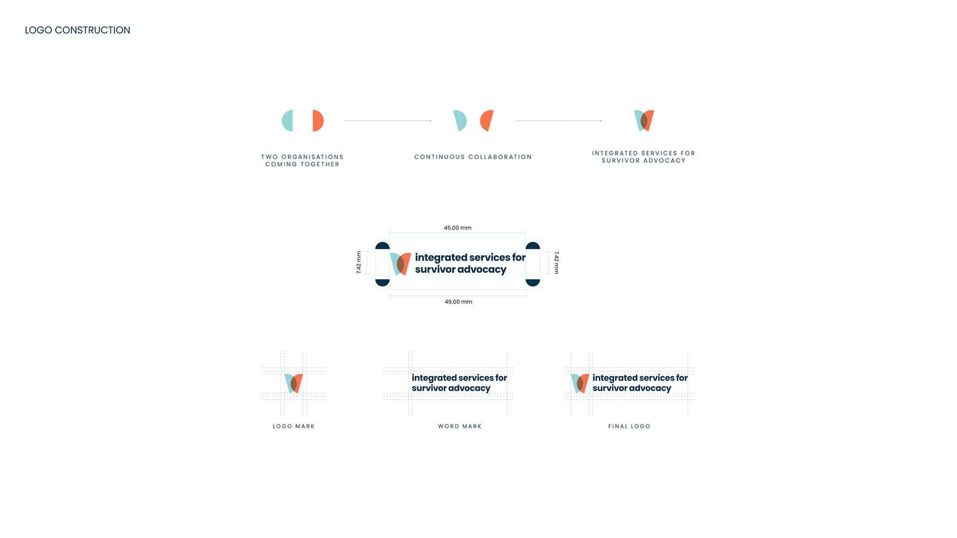
Logo Construction: The two halves of the circle in the logo represent both organisations coming together for continuous collaboration. One half of the circle is placed at a 75° angle whereas, the other half at 105° to form a butterfly. The butterfly symbolism works as a representation of resurrection, change, renewal, hope, endurance & courage to embrace the transformation to make life better for victims of crime, family & sexual assault. It also embodies the culture & values which both SMLS and SECASA stand for.
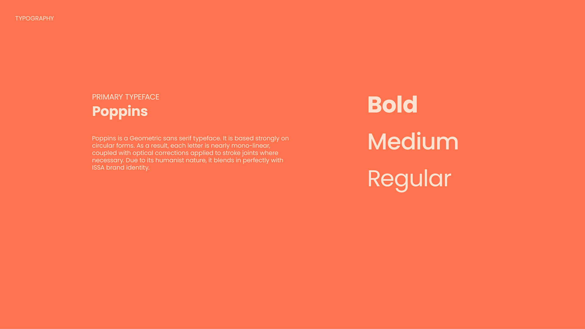
The wordmark uses the bold weight of the font (Poppin) all set in lowercase to make the brand approachable and friendly. Poppins is strongly based on circular forms and its humanistic nature harmonises with the brand characteristics.


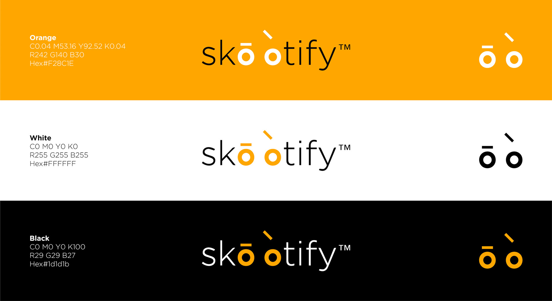
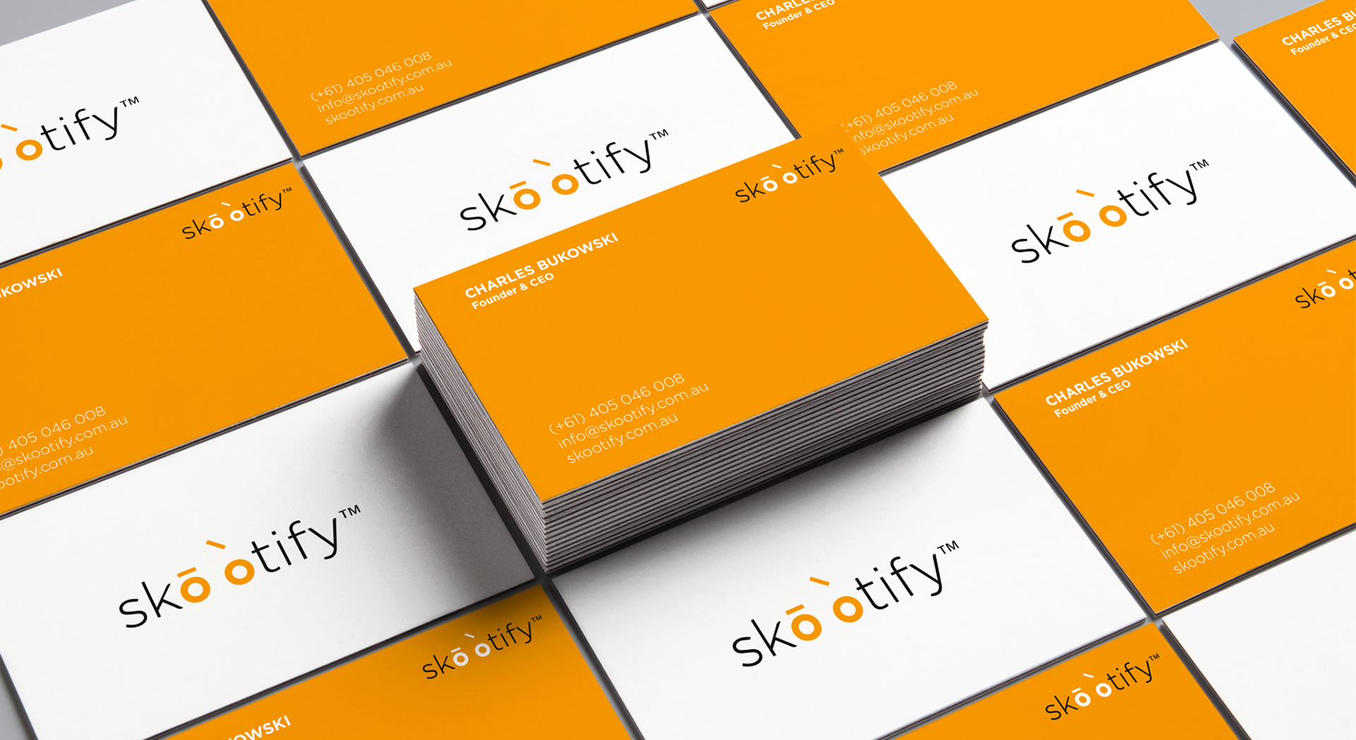
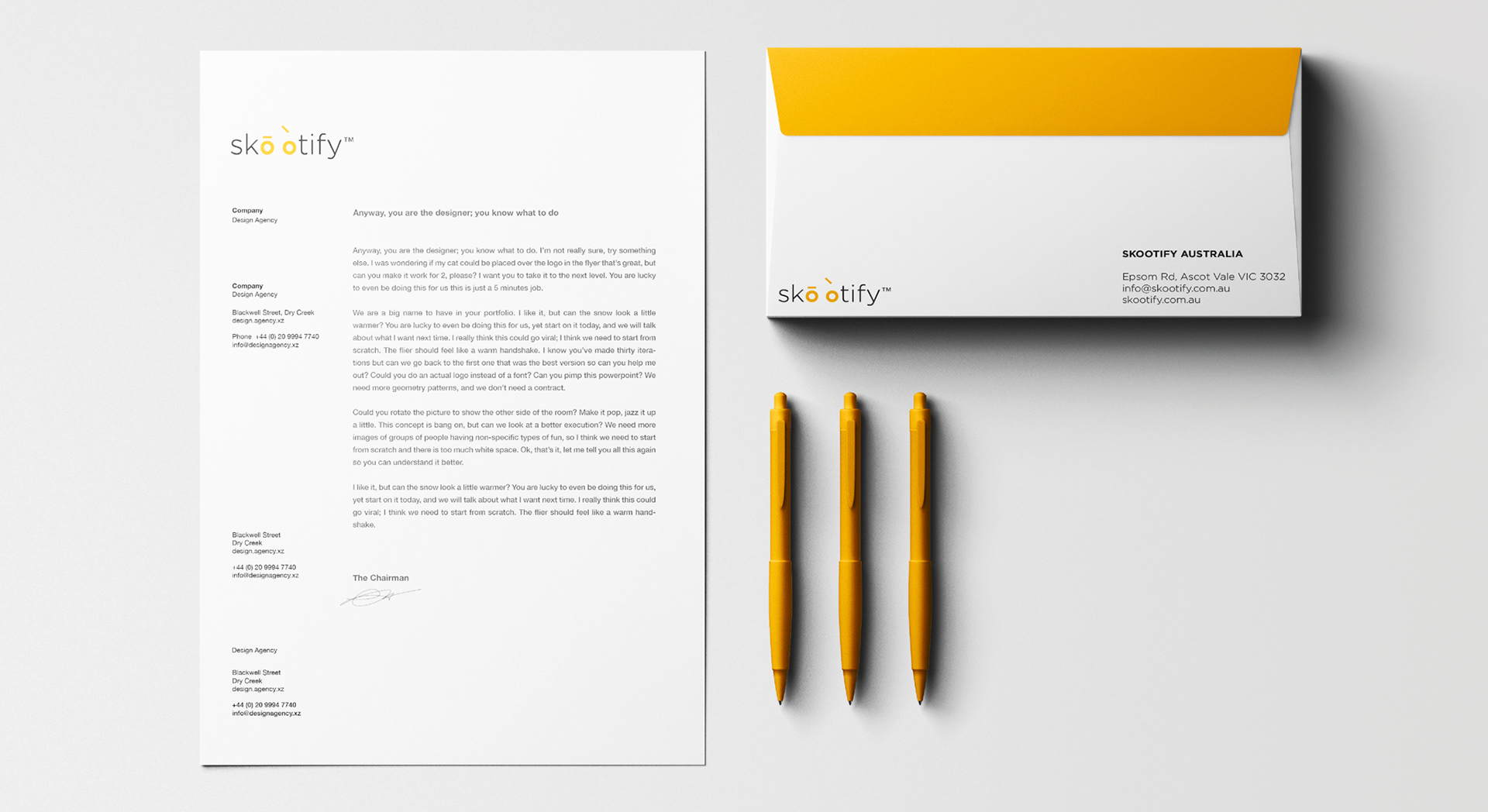
Skootify
Skootify is a Melbourne-based scooter renting company. The brand identity was designed with the intent to give the brand a friendly & warm vibe while keeping it relevant, modern & trustworthy.